landinganalyze.com
Landing Page Analysis
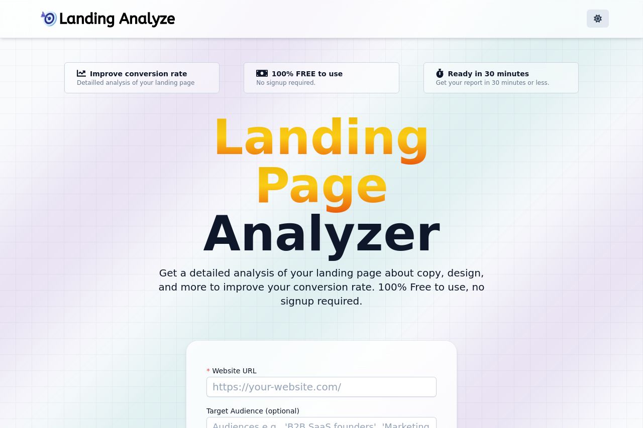
Get a detailed analysis of your landing page about copy, design, and more to improve your conversion rate. 100% Free to use, no signup required.
Summary:
The Landing Analyze page has a clear value proposition, emphasizing free and quick access to landing page analysis tools. The messaging is straightforward but lacks any real punch to make it memorable.
The readability is fine with short, concise text, but it could use additional formatting to break the monotony, also noted in the FAQ section which is quite bland.
Design-wise, the page uses consistent color schemes and has a decent visual hierarchy, but the grid-patterned background feels somewhat outdated. The CTAs are highly visible, although repetition of visuals adds a sense of redundancy.
The structure is logical, with relevant information and CTAs easily accessible, yet it misses an element of engagement or personality.
Credibility is built up through social proof, displaying recently analyzed landing pages.
- Enhance CTA text with more engaging language, such as "Boost My Conversion Now!".
- Update the background design to something more modern and less distracting.
- Improve the FAQ section with bolder headings and concise answers.