pricerunner.com
Landing Page Analysis
Don´t overpay online! ✓ Use PriceRunner to find lowest prices on 3.4 million products from 6,400 UK stores. ✓ Discover your savings today!
Summary:
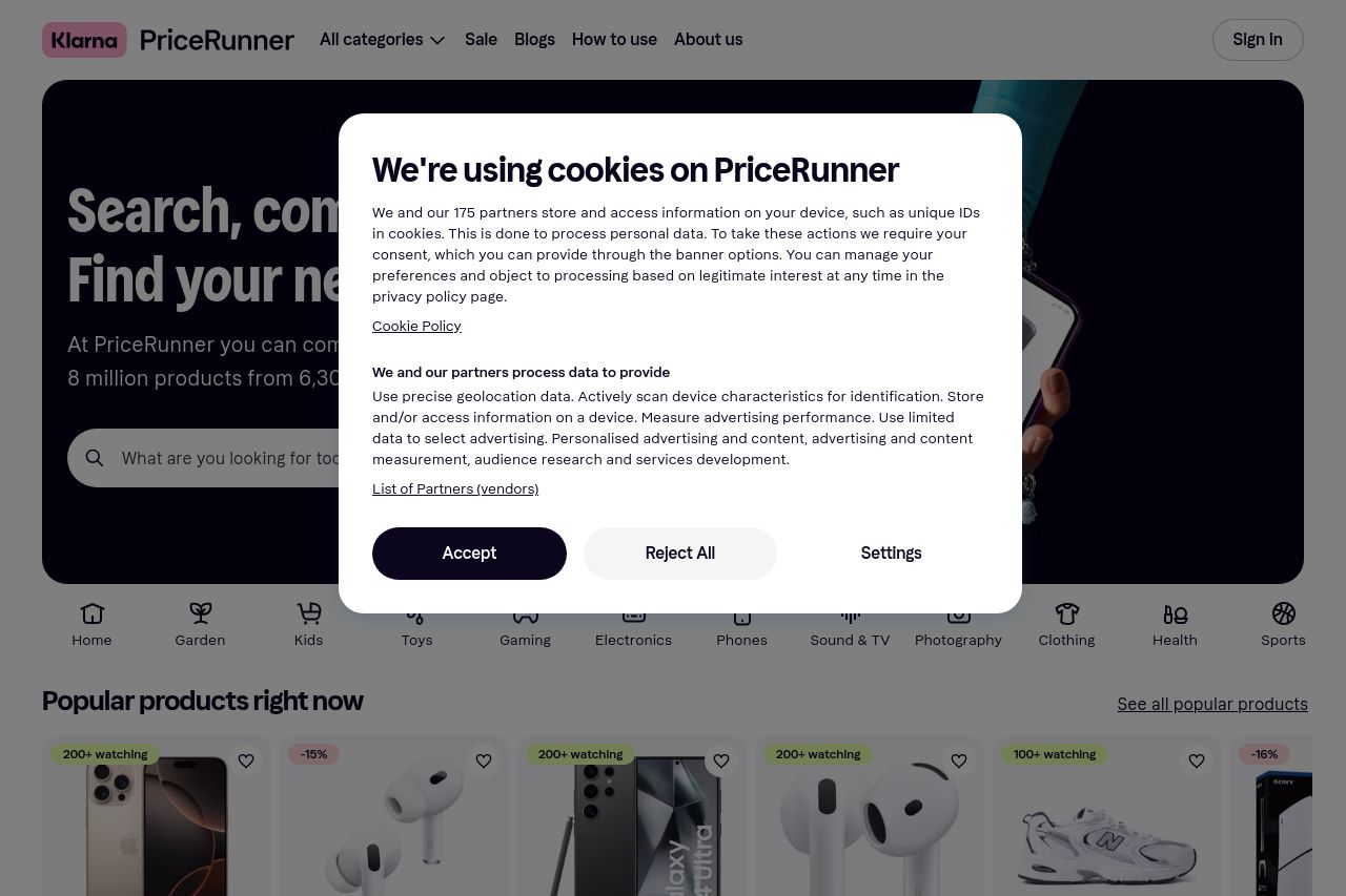
The PriceRunner landing page presents a pleasing structure, offering substantial information about various products. However, the persistent cookie banner is incredibly distracting, covering essential content and obstructing user experience repeatedly. The emphasis on popular products is well-placed but visually becomes repetitive and overwhelming, given the lack of variation. CTA placements are solid but lack distinction, needing more differentiation to enhance focus and urgency. The color palette supports readability, though some sections appear too cramped, and overuse of whitespace could be more strategic. Missing is a clear, compelling value proposition right up front that succinctly tells users why they should engage further with PriceRunner instead of competitors.
- Reduce the cookie popup's intrusion to enhance user experience.
- Improve visual differentiation for important CTAs to improve conversion rates.
- Enhance initial value proposition clarity to better communicate unique advantages.
- Rearrange and space out product displays for better viewing comfort.