vercel.app
Landing Page Analysis
Summary:
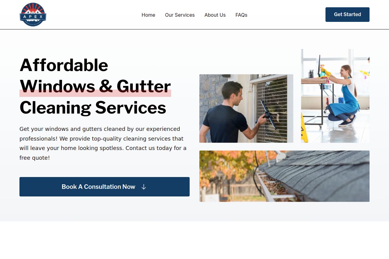
The landing page is clean and pretty functional overall, but there's definitely room for improvement. The value proposition is fairly clear with visuals supporting the service description, yet it lacks persuasive power and specificity. Text simplicity could be better since some sections use generic placeholder content that detracts from professionalism. The design feels somewhat bland and does not entirely stand out or have a modern touch that grabs attention. The structure is mostly okay, but the lack of consistency in spacing and alignment makes it feel slightly disorganized in parts. Credibility gets a boost with clear contact information but needs more reassuring elements like testimonials or badges to instill confidence. The CTA placement is decent but could use more strategic positioning to guide users more intuitively. Overall, it's a decent start but definitely not memorable or compelling enough to leave a lasting impression.
- Use persuasive testimonials to build trust.
- Enhance visual design with a modern, coherent color scheme.
- Replace placeholder text with meaningful content.