booking.com
Landing Page Analysis
Explore the world with Booking.com. Big savings on homes, hotels, flights, car rentals, taxis, and attractions – build your perfect trip on any budget.
Summary:
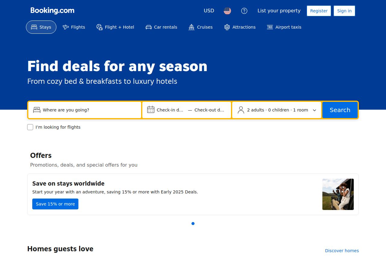
The Booking.com landing page is strategically well-laid out, showcasing a diverse range of accommodations with a strong emphasis on deals, which is visually appealing. The "Find deals for any season" headline immediately presents a value proposition that captures the essence of what users are likely looking for: good offers. The breadcrumb navigation is clear and comprehensive, facilitating ease of browsing through different property types and locations. In terms of readability, the page effectively uses hierarchy with bold contrasts and clear typography, but suffers from text blocks that lack engaging language. The call-to-action buttons are clearly visible but might lack variation, potentially blending too much with other elements. Credibility indicators are exemplary, showcasing reviews and ratings prominently, which enhances trust but the page's overall connectivity across elements might feel slightly disjointed. Ultimately, while the page's sections flow logically, further tweaking of headlines and content could enhance engagement.
- Enhance CTA visibility by using distinct colors or styles to differentiate from other content.
- Add more engaging and targeted language to text blocks for improved connection with users.
- Improve connectivity between sections to ensure a seamless flow of information.