dartblaze.com
Landing Page Analysis
Summary:
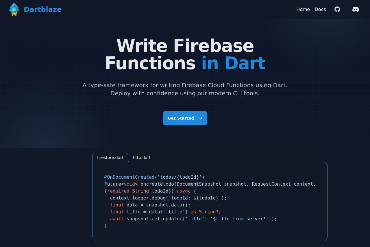
Overall, the Dartblaze landing page is visually appealing and functional, but there are areas that need enhancement. The headline is clear, but it could engage more with a stronger call-to-action. Value propositions are well-communicated, catering to the audience's needs, but could use more tailored content for diverse user levels. Design is cohesive, with a consistent color scheme that aligns with developer preferences; however, some text sizes are too similar, diminishing the visual hierarchy. The structure is logical, with easy navigation, but the lack of pricing or detailed use cases is a missed opportunity. Calls to action are visible but could be more engaging to boost conversions. Credibility elements are minimal, impacting trust—more testimonials, client logos, or founder mentions could strengthen this aspect.
- Increase contrast for headings to improve visual hierarchy.
- Add pricing or a demo section for more engagement.
- Include testimonials or client logos for credibility.
- Enhance CTAs with action-oriented language.