ai4ngo.org
Landing Page Analysis
Summary:
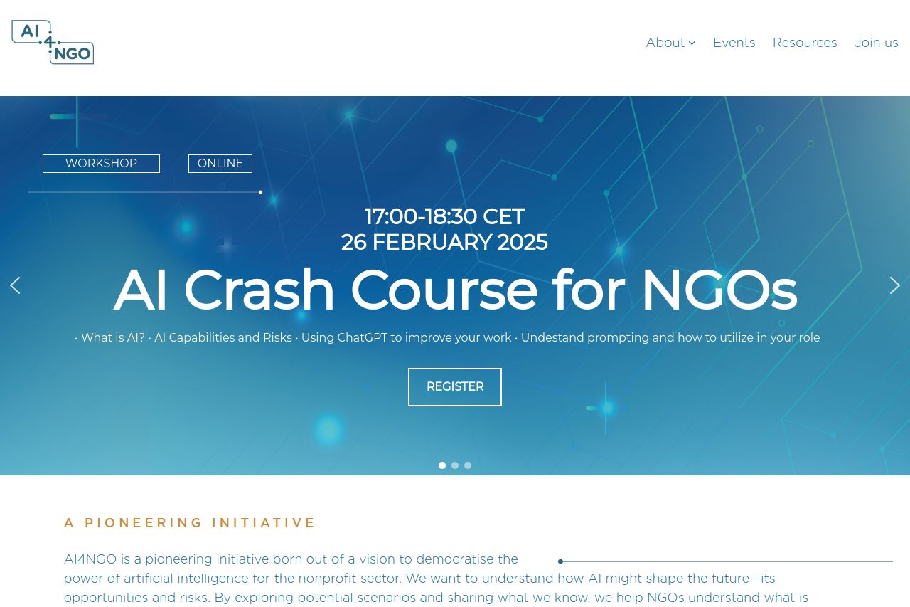
The AI4NGO landing page delivers a clear message, focusing on empowering NGOs with AI solutions. The hero section provides a strong introduction but lacks engaging visuals to keep the user interested beyond the initial glance. The following sections attempt to communicate the purpose and offerings but suffer from overly technical language and inadequate visual appeal. There is a recognizable effort to connect with the audience, but it falls short in creating an engaging experience.
Design-wise, there's a decent attempt at maintaining consistency with fonts and colors, but a lack of visual hierarchy makes navigation less intuitive. The sections could benefit from better alignment and emphasis on important information. Call-to-actions blend into the text and lack urgency, reducing their effectiveness. Overall, credible attempts at providing information are present, but execution drags the effectiveness down.
For improvements, focusing on simplifying language, enhancing visual elements, and creating a clearer navigation structure would go a long way in improving user experience. Highlighting benefits to NGOs in a more relatable way could significantly boost engagement.
- Simplify technical language to be more accessible.
- Improve the visual hierarchy with contrasting colors and font sizes.
- Place CTAs more strategically to enhance visibility and engagement.