bssholland.com
Landing Page Analysis
64
Share on:
Summary:
50
Messaging
50
Readability
65
Structure
60
Actionability
60
Design
80
Credibility
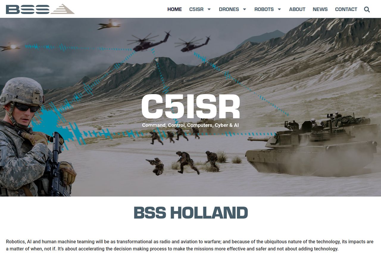
The overall presentation is consistent, with a solid, professional look matching an industrial/corporate theme. However, the messaging lacks clarity and specific benefits, making it hard for the visitor to grasp quickly why they should care. The visual aesthetics are good but not stunning, and the icons and imagery, while relevant, aren't particularly engaging or informative. The page could use better hierarchy and navigation improvements. Additionally, credibility is evident with certifications and client logos, but the social proof could be more engaging. The repetition of CTAs and content is a bit lackluster. Everything feels kind of blah and generic without any real standout or memorable elements.
Main Recommendations:
- Make the value proposition clearer and more concise.
- Improve the visual hierarchy with more varied typography and emphasis.
- Enhance the call-to-action buttons for visibility and actionability.