hrs.de
Landing Page Analysis
Mit HRS Hotels buchen und bis zu 50 % sparen: Exklusive Vorteile für myHRS Mitglieder, kostenlose Stornierung bis 18 Uhr in vielen Hotels, Meilen & Punkte sammeln.
Summary:
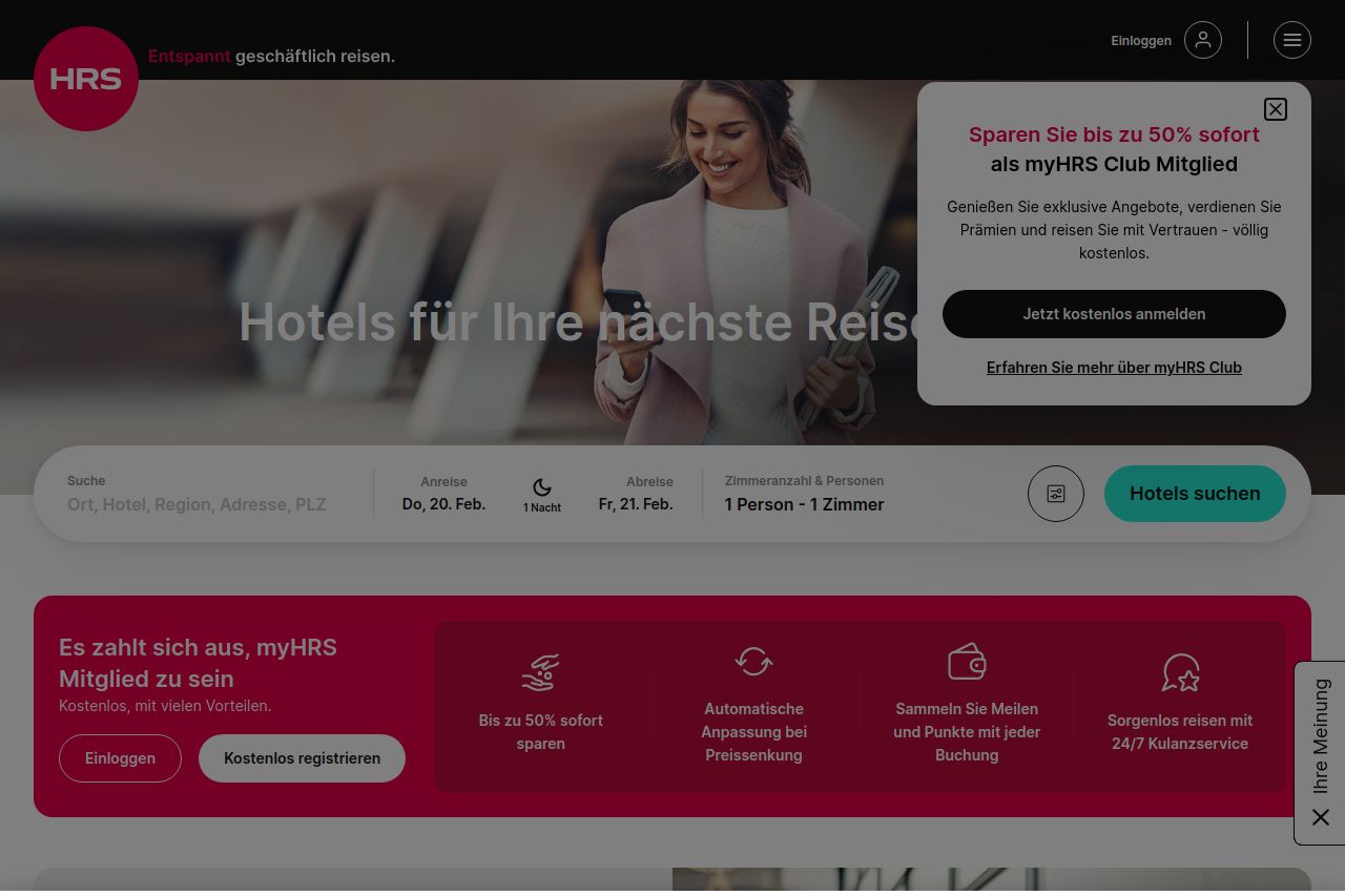
The landing page makes a strong impression with its professional look and feel, but it suffers from some critical flaws. The value proposition is somewhat clear, focusing on hotel bookings, yet it's overcrowded with unnecessary elements like a gigantic cookie consent that dominates the screen. There’s an overload of pop-ups and tabs that can overwhelm users instead of guiding them to booking conversions. While the design elements are consistent and visually appealing, the structure and flow of information are not well-organized, making it difficult for users to navigate smoothly and find desired details easily. The text could be less verbose, aiming for concise and engaging content. Social proof elements are well established, adding credibility, but the CTAs are not prominent enough, blending too much with other elements, which diminishes their actionability.
- Reduce the prominence of the cookie consent to a less distracting banner.
- Highlight the CTAs better to make them stand out, like the 'Jetzt kostenlos anmelden' button.
- Simplify the text to improve readability and engagement.
- Enhance the flow of information by logically structuring content sections.