netlify.app
Landing Page Analysis
Summary:
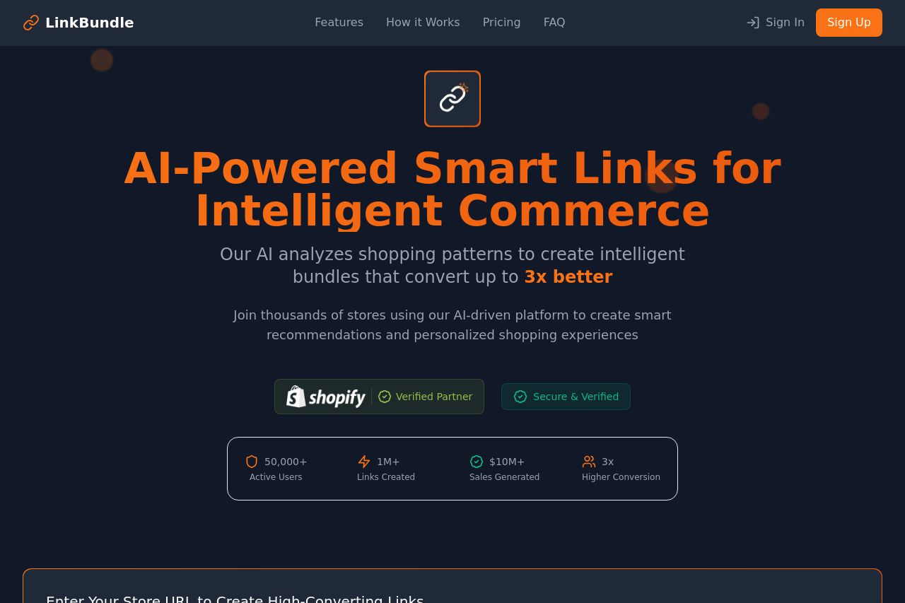
LinkBundle’s landing page does a decent job at presenting its offering with a straightforward layout and clear sections.
The hero section attempts to immediately grab attention with a clear value proposition, showcasing AI-powered smart links. However, the message feels a bit robotic with overuse of buzzwords like "AI" and "smart," which can be off-putting without specific context or examples.
The design is clean but a bit too safe, sticking to a predictable structure without any unique visual appeal. How It Works section maintains clarity with simple steps that guide users, but lacks dynamic content like animations or interactive elements that could increase engagement.
The pricing section is straightforward, which is good, but doesn’t really sell the value of each plan. The sheer amount of text in cards could overwhelm and distract instead of inform.
On the other hand, the FAQ section is neatly organized but could benefit from a more engaging layout, since it looks a bit dull. Lastly, the Why Choose LinkBundle? attempts to reinforce credibility, but comes off as vague and doesn’t offer enough convincing details.
Overall, it's an average landing page that might do better with enhancements in design flair and deeper, more human messaging that truly connects with potential users.
- Add more engaging visuals or interactive elements in the 'How It Works' section.
- Refine the messaging to be more personalized and avoid overuse of generic buzzwords.
- Rework the FAQ layout for better engagement, perhaps with collapsible sections.