capco.com
Landing Page Analysis
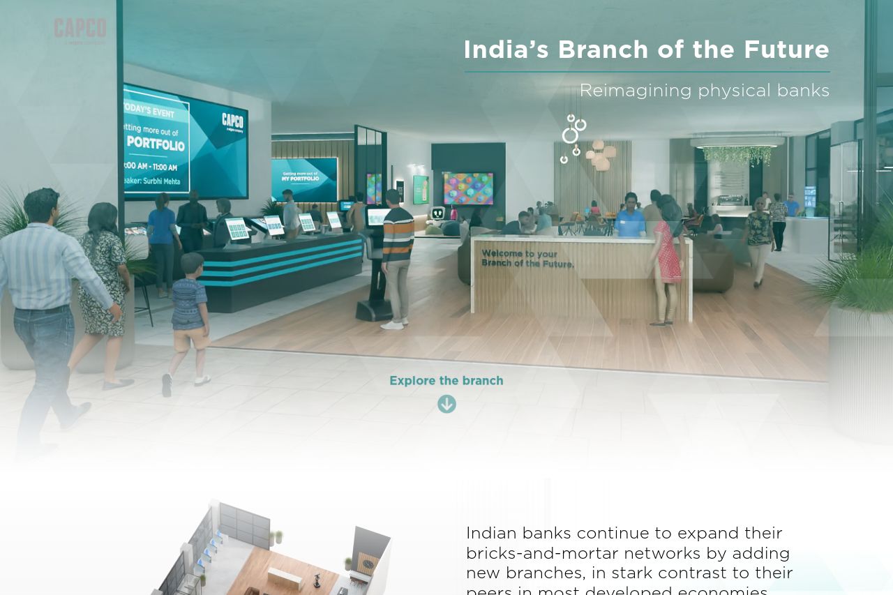
Our new article explores how India’s branch of the future can offer a more personalized and community-driven experience that improves financial awareness.
Summary:
This landing page is a mixed bag. The messaging is somewhat focused, with clarity around the subject of reimagining physical banks but lacks specificity in how this is achieved. The tone is consistent with the target audience, maintaining a professional demeanor. Readability is poor, with overly long sentences and jargon making it tough to grasp quickly. Visual clarity is also lacking, as the color contrast is suboptimal, blending in with the rest of the page rather than standing out. Design consistency is middling, suffering from a lack of visual hierarchy and inconsistency in imagery. There is no clear logical structure to guide the reader through the content, resulting in a cluttered experience. The CTAs are not prominent or enticing, missing an action-oriented verb and not strategically placed. Credibility is strong due to the company's established presence, but it could benefit from more visible trust elements like testimonials or partner logos.
- Improve readability by breaking text into shorter sentences and paragraphs.
- Revise the CTA to be more action-oriented and prominent.
- Enhance visual hierarchy with better use of font sizes and colors.
- Incorporate testimonials or client logos for added credibility.