arbeitszeittracker.de
Landing Page Analysis
Mit ArbeitszeitTracker kannst du und dein Unternehmen in wenigen Minuten deine Arbeitszeit erfassen. Unkompliziert und schnell.
Summary:
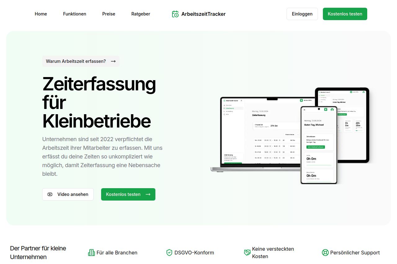
The landing page for ArbeitszeitTracker does a decent job of addressing the target audience of small businesses in Germany. The hero section is straightforward with a clear value proposition but lacks imagery to emotionally engage the visitor or convey the full utility of the product. The use of white space and minimal typography is effective for readability, but the design could benefit from more differentiation between sections to guide the eye naturally.
Messaging is generally on point, explicitly mentioning compliance and ease of use, which are crucial for German businesses. However, there's a lack of strong social proof, which could build more trust with potential clients. The CTAs are present and easy to find, but they could be more action-oriented or persuasive. Overall, the page is slightly bland with nothing standing out strongly except for the clarity of message, which alone is not enough to convert.
- Enhance the visual hierarchy by using more varied font sizes and weights for headings and subheadings.
- Incorporate testimonials or case studies to build trust and credibility with potential users.
- Make CTAs more action-oriented by including specific benefits in the button text.