betafpv.com
Landing Page Analysis
We focus on FPV micro whoop with superior quality gear and the best customer service.
Summary:
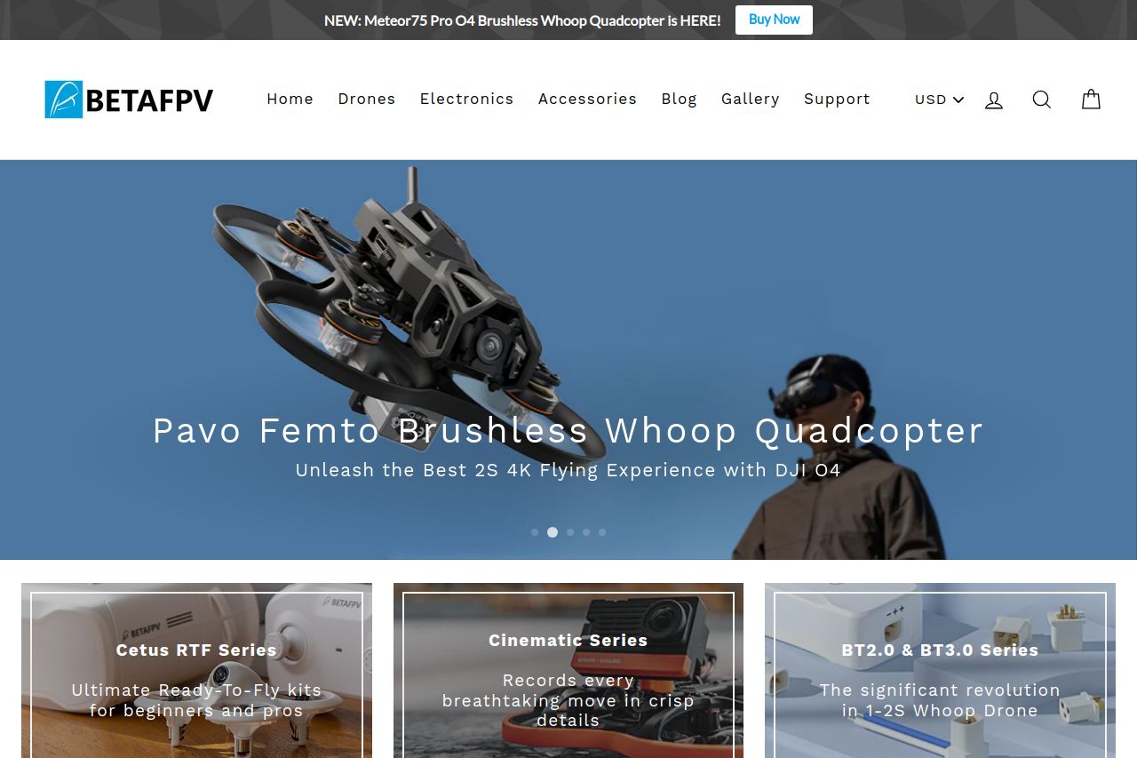
The webpage is quite professional and exhibits several strength points, especially in its clean layout and well-categorized product displays. The color scheme aligns nicely but is slightly dull, lacking excitement.
The hero section grabs attention with the main product and a suitable CTA, though the copy could be more enticing. Product showcases are visually appealing, featuring high-quality images, but many lack engaging or persuasive descriptions that could enhance conversion.
Reading flow is generally smooth, although sections sometimes feel a little cluttered, potentially overwhelming users with options instead of guiding them smoothly.
In terms of design consistency, it's sound, but there's room for improving visual hierarchy like varying text sizes to emphasize key information. The site provides decent social proof and credibility elements, but it could enhance user trust by being more transparent about the team and company background. CTAs are present, but they need to stand out more against the page's neutral tones.
- Enhance the hero section CTA with more vivid language like 'Discover the Future of Flying'.
- Improve product descriptions with clearer benefits and unique selling points.
- Consider rearranging product sections to better guide the user journey.
- Increase contrast in CTAs to make them more visually striking.
- Incorporate more testimonials or user-generated content to build trust.