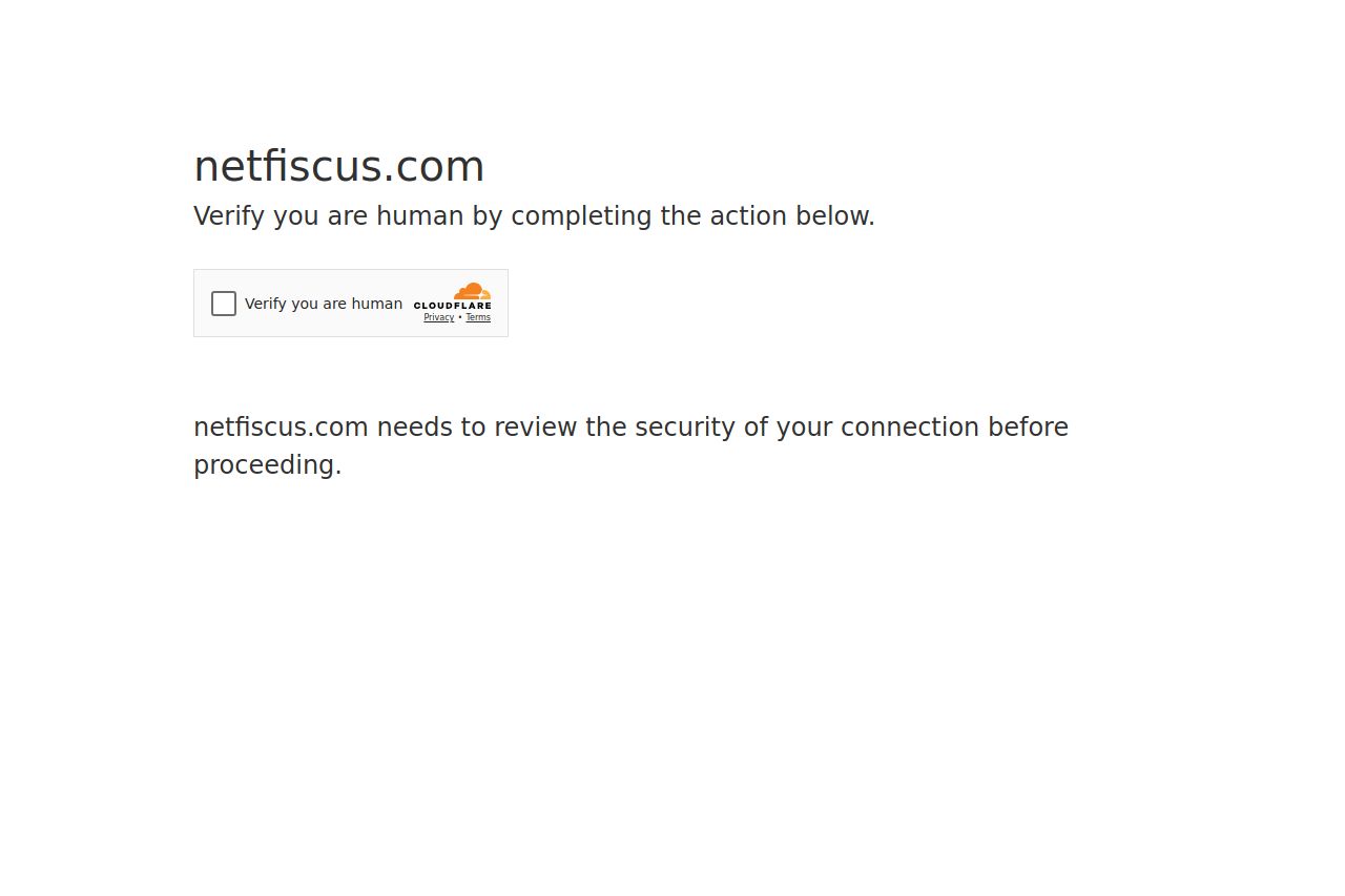
netfiscus.com
Landing Page Analysis
35

Website:
https://netfiscus.comGenerated on:
February 19, 2025Score:
35/100Audience:
Personal finance enthusiasts Share on:
Summary:
10
Messaging
70
Readability
0
Structure
40
Actionability
30
Design
50
Credibility
The page is essentially just a verification step, not an actual landing page, so there's not much content to evaluate based on typical criteria for conversion and messaging. The design is minimalist but serves its purpose, but feels too basic and can be off-putting to new visitors who expect a more welcoming and informative initial interaction. The use of a reCAPTCHA is necessary for security, but it's not introducing any excitement or engagement for potential users. This kind of introduction does not reflect the branding, mission, or value proposition of the business, leaving users with no information about the website itself.
Main Recommendations:
- Enhance the introduction with some branding or a brief message.
- Add some basic information about what users are accessing.
- Improve visual appeal with minimal design changes.