gmbapi.com
Landing Page Analysis
Multi location Local Search software. Improve local visibility, manage your reputation and content, and efficiently monitor hygiene and results.. No contracts.
Summary:
Overall, the landing page attempts to communicate the value of its SEO software effectively, but there are glaring issues that hinder its potential.
The messaging is quite strong, with a clear value proposition and repeated "free trial" incentive. However, it fails to specify what makes this tool truly different from others in the market aside from generic claims. It's missing a concrete targeting of pain points or use cases specific to the B2B audience. The tone is generally professional, which suits the target audience, but lacks a bit of punch to be engaging.
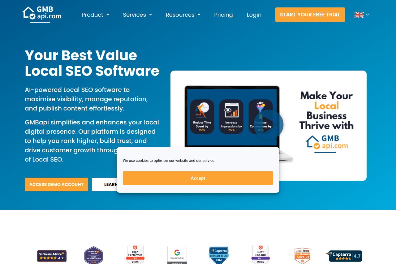
Readability and Content: The text tends to be overly verbose at times, potentially overwhelming visitors with information instead of enticing them. The visual clarity is decent, although there's a consistent issue with the cookie consent banner popping up repeatedly, which is quite annoying and distracts from the rest of the page.
Design and Structure: The design is cohesive in terms of colors and consistency, gravitating towards a professional layout. Yet, it feels a bit too safe or "template-like," lacking unique elements that could make it memorable. The visual hierarchy is reasonably managed but can be improved by diversifying font weights and sizes more effectively. Information hierarchy could be better; the "How Are We Different" section seems buried and might not immediately grab attention.
CTAs and Actionability: CTAs are too generic, with phrases like "Learn More" being overused and lacking specificity regarding the actual benefits of the free trial. They are visible but not particularly enticing or motivating action. Placing CTAs more strategically, aligned with user interest points, could vastly improve engagement.
Credibility: Strong demonstration of credibility with testimonials and client logos. Social proof is definitely a highlight of this page and should be capitalized on more visibly.
- Revise the repetitive cookie consent banner to be less intrusive.
- Highlight unique selling points or competitive advantages in the messaging.
- Use more dynamic and action-oriented CTA phrases suitable for targeted conversion.
- Add more specific examples or case studies to engage B2B marketers.
- Improve the design by introducing subtle unique visual elements to stand out.