launchpedia.co
Landing Page Analysis
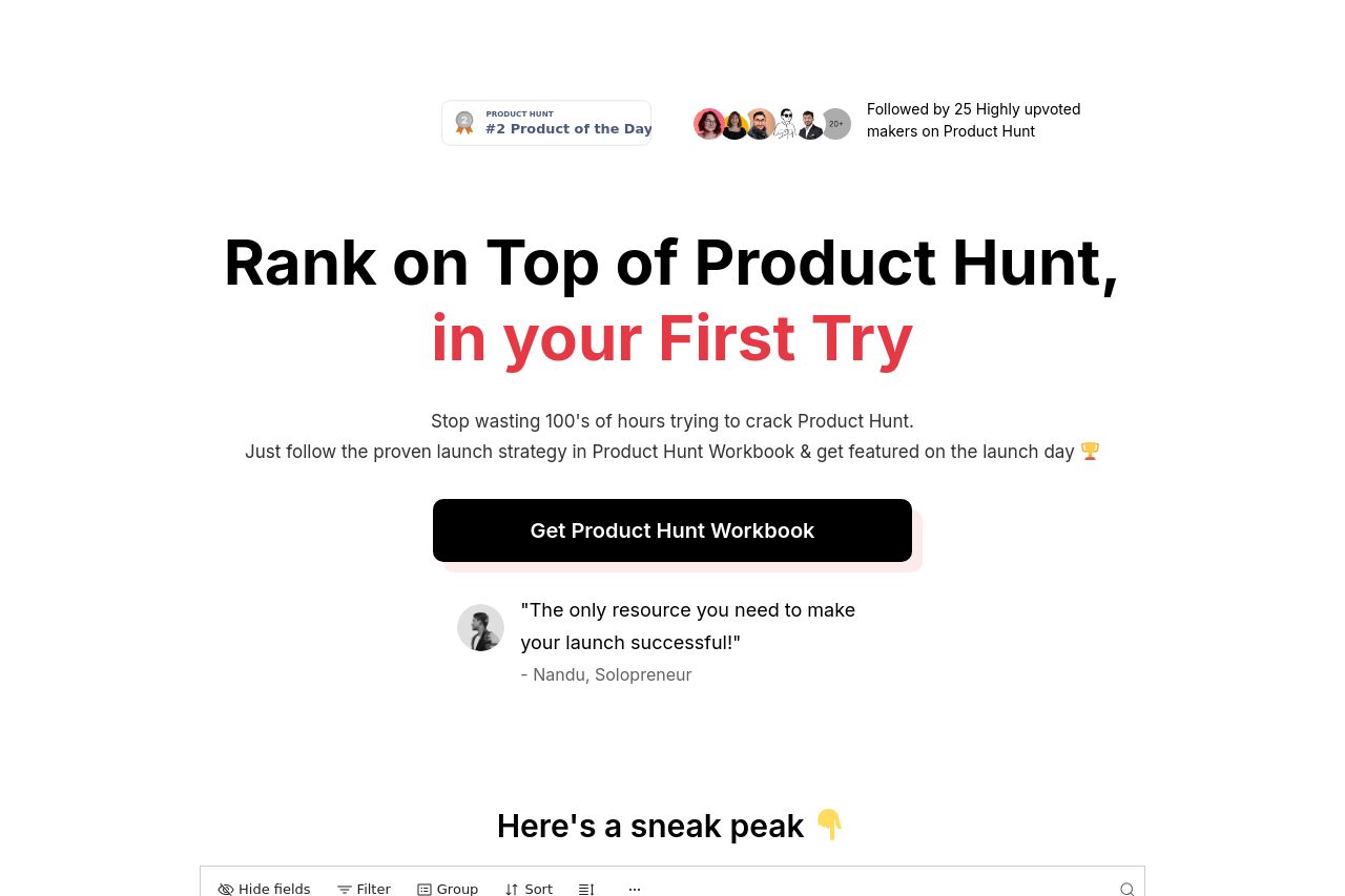
Followed by 25 Highly upvoted makers on Product Hunt
78
Generated on:
February 19, 2025Score:
78/100Audience:
SaaS FoundersShare on:
Summary:
75
Messaging
75
Readability
80
Structure
65
Actionability
70
Design
80
Credibility
The landing page aims to make a bold impression with a clear focus on getting results on Product Hunt. The call to action is enticing, and the testimonials add a level of credibility. However, the page struggles with over-the-top marketing language and repetition, which can feel tiresome.
Visual hierarchy is mostly consistent, but the abundance of bright colors and bold fonts can be somewhat overwhelming. The structure is logical, but the content gets a bit redundant as you scroll down. Adjusting the balance between information and persuasion could make it more engaging.
Main Recommendations:
- Reduce repetition in testimonials and introduction.
- Simplify and clarify CTAs with varied actions.
- Balance visual design to reduce overwhelm.