framer.app
Landing Page Analysis
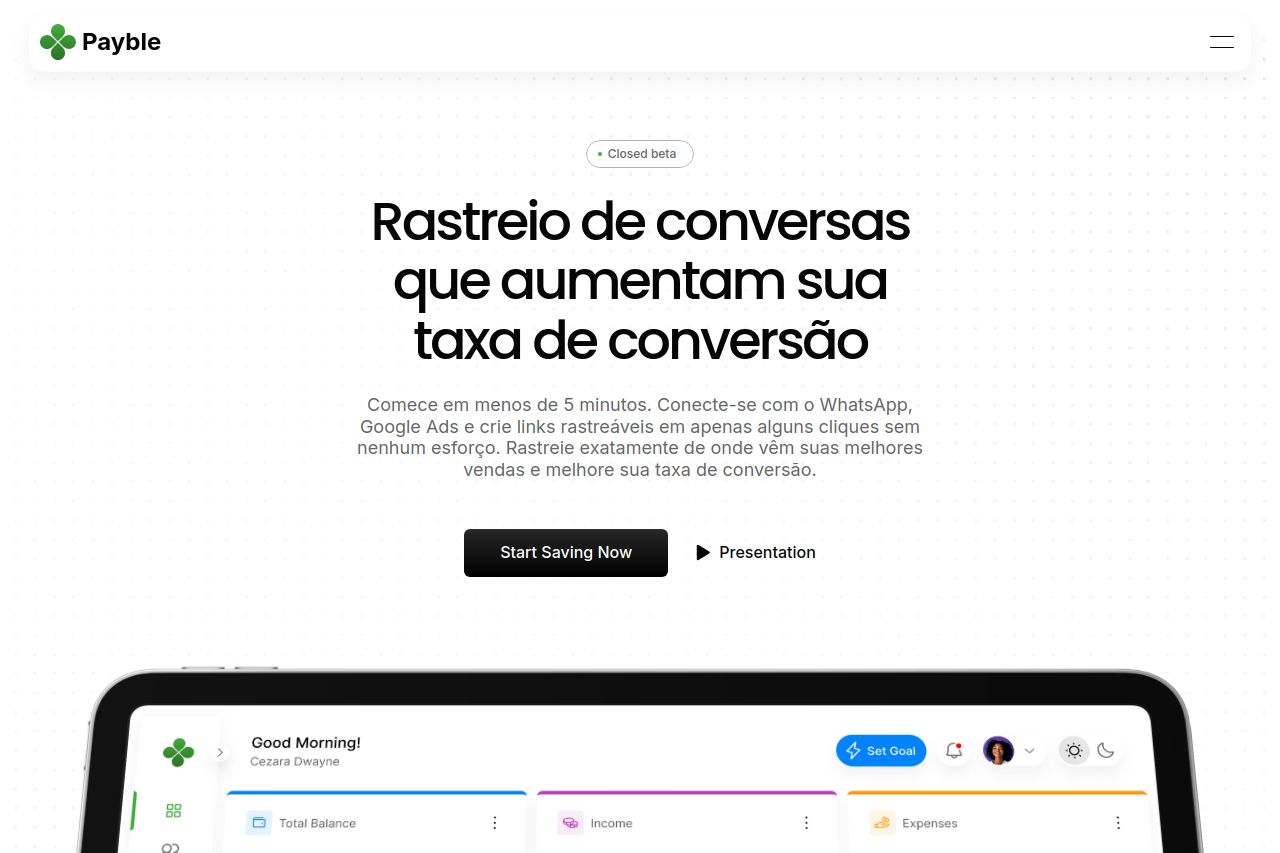
Bring your financial platform vision to life with Payble, a sleek and versatile Framer template crafted for innovators in the personal finance space.
Summary:
The landing page has a clean and modern design with a consistent theme throughout. The use of whitespace is effective, creating a professional and organized look. However, the text can be overwhelming, with sections cluttered with too many details, making it hard to digest quickly. The value proposition isn't immediately clear, which might lose the attention of potential users. The CTAs are present, but they don't always stand out, blending too much with the rest of the content. Social proof elements are lacking, which might make users skeptical about the credibility of the product. Overall, the page attempts to provide an extensive amount of information but needs better structuring and prioritization to enhance user experience and conversion.
- Clarify the main value proposition in the hero section with a stronger, concise statement.
- Enhance CTA buttons to make them more visually prominent and persuasive.
- Add testimonials or case studies to build trust and credibility.
- Simplify and break down text into more digestible snippets.