clientwords.com
Landing Page Analysis
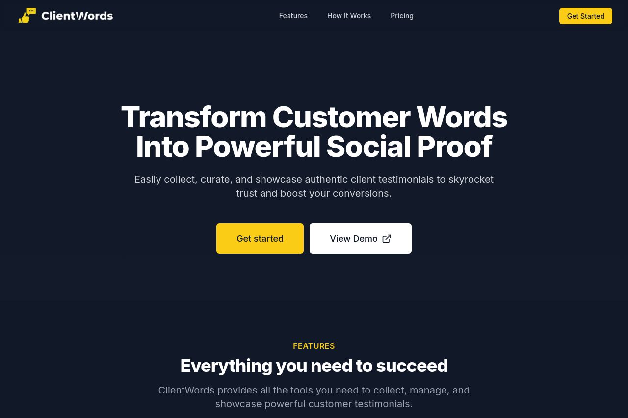
Elevate your business credibility with your Client's Words - the smart way to collect, manage, and showcase powerful customer testimonials
Summary:
The landing page for ClientWords is visually appealing and structured well, but it falls short in a few key areas. The main value proposition is clear at the outset, highlighting the transformation of customer words into social proof. However, the repetitive layout across sections becomes monotonous. The CTAs are well-positioned but lack variation in phrasing to drive different actions. Messaging is concise yet might risk oversimplifying complex services. The color scheme is cohesive, fostering a professional feel, though the lack of color variety might not maintain user attention throughout. The design is clean, but icon imagery risks being too generic, reducing the uniqueness of the presentation. Information about price and features is clearly laid out, yet could be more engaging with real-life use cases or testimonials, ironic for a testimonial-focused service. Overall, while the page fulfills certain functional and aesthetic criteria, it lacks punch in engagement and differentiation.
- Incorporate real customer testimonials or case studies for authenticity.
- Diversify CTA language to encourage a variety of actions.
- Include more varied imagery or graphics to break visual monotony.