startuppeople.com
Landing Page Analysis
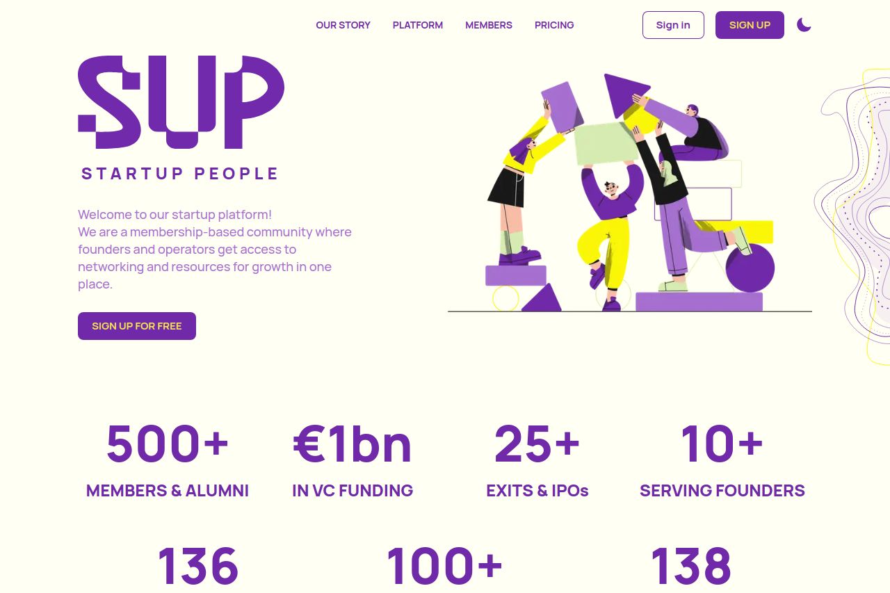
Join a founder community that's raised €1bn in VC funding. Access €100k+ in perks, fundraising resources, growth playbooks, and expert workshops. Start your startup journey for free.
Summary:
Startup People landing page offers a clean design with a cohesive color scheme, emphasizing its membership-based community for founders. However, the cookie pop-up's repetition and positioning are a bit distracting. The value proposition is somewhat clear but lacks emphasis on unique benefits. While the typography is consistent, some sections could benefit from more engaging sub-headlines or formatting to guide the user easily. Trust elements, like testimonials and partner logos, are well utilized for credibility, yet the CTAs could be more assertive and strategically placed to enhance conversion. Overall, the design supports readability but needs more bite to draw and maintain attention, particularly for a startup audience eager for new and dynamic content and experiences.
- Make the value proposition more prominent and specific about unique offerings.
- Improve CTA relevance and placement for better user engagement.
- Minimize and better position the cookie banner to reduce distraction.