geekforbiz.com
Landing Page Analysis
Your Partner in Digital Growth. Android Apps, Websites, WebApps & More in your Budget.
Summary:
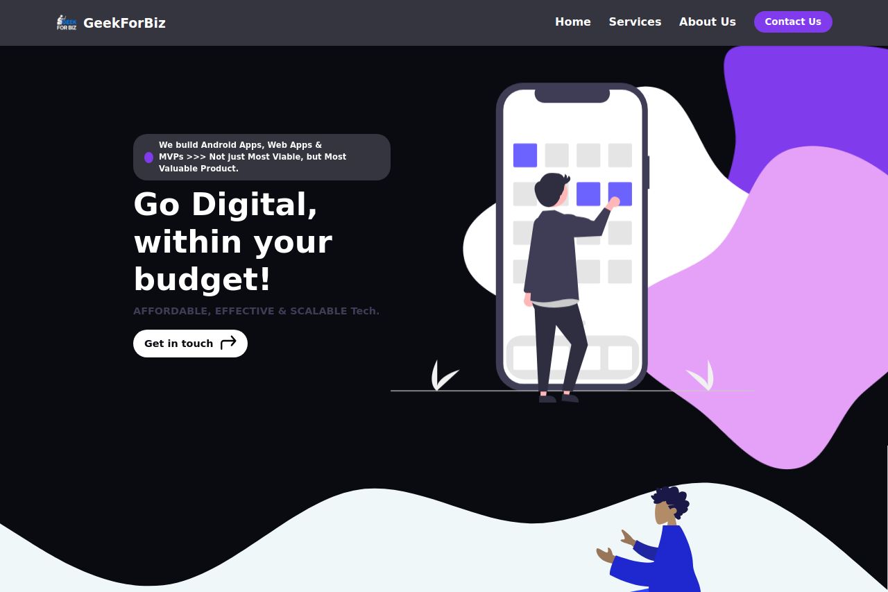
The landing page is visually cohesive with a trendy, modern design that appeals to startups and MSMEs. However, aesthetic isn't everything—the messaging needs work. The main value proposition of budgeting "Go Digital, within your budget!" doesn't deliver its promise well due to lack of supporting details and specifics about pricing, or unique service benefits. Tone wise, the casual, enthusiastic language is approachable but somewhat lacks focus. There’s community vibe with testimonials, but more social proof like recognizable logos would solidify credibility.
The navigation is straightforward with intuitive headings, but visually, the CTAs aren't as compelling as they should be, somewhat lost among similar elements. The big issue is readability; the fonts are okay, yet text-heavy areas with less formatting could deter readers. The use of whitespace compensates for this a bit, ensuring consistency in design but more clarity remains necessary. Overall, more refinement in messaging clarity, text layout, and emphasis on action is needed to maximize the landing page's potential for converting visitors into clients.
- Clarify and strengthen the main value proposition by including specific pricing models or examples.
- Adjust CTA designs to be more prominent and distinguishable from surrounding text.
- Incorporate recognizable client logos or partnerships for additional social proof.