com.au
Landing Page Analysis
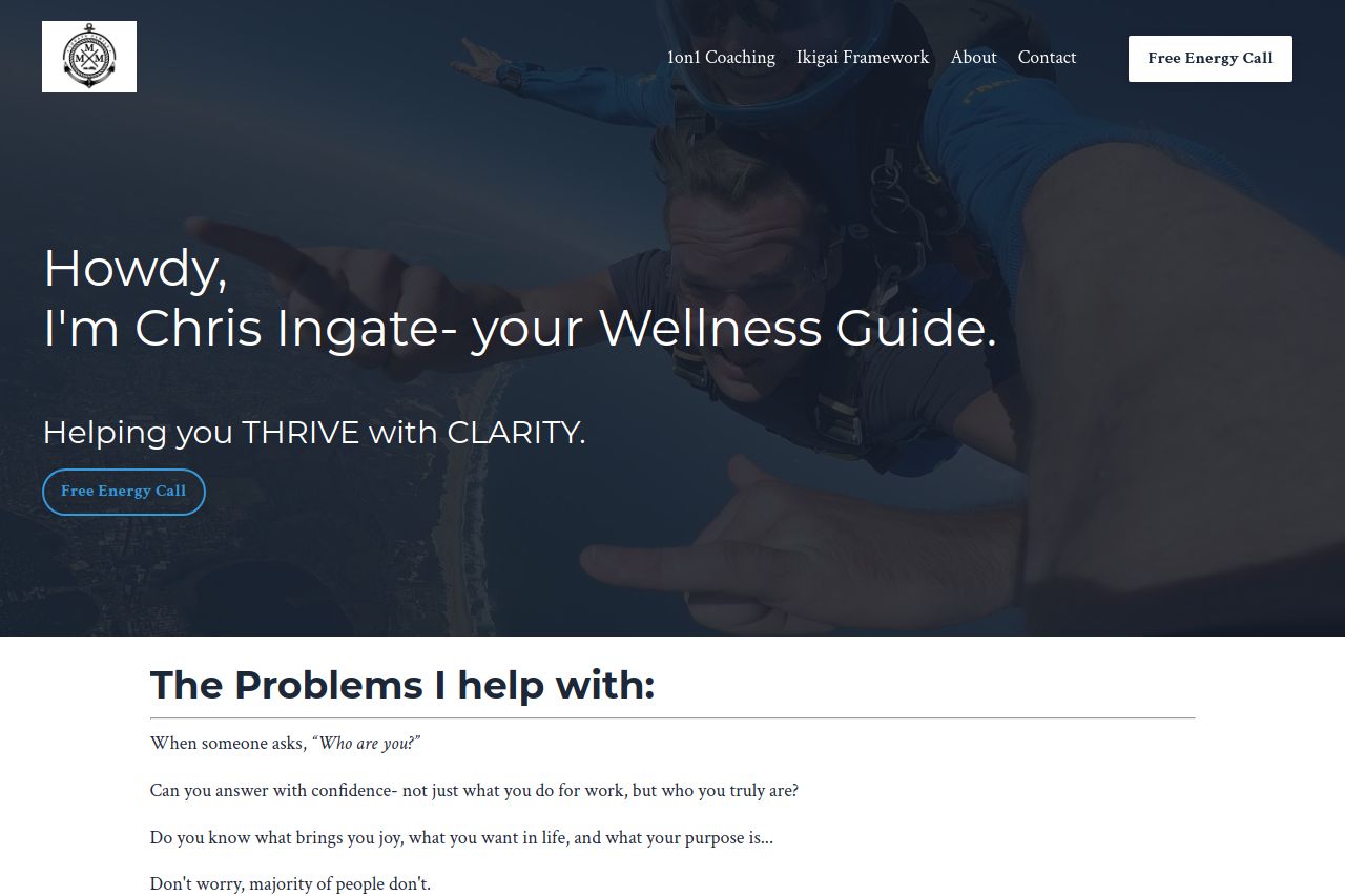
Do you dread going to work? Lack purpose? Start this 4-week course to help discover your Ikigai / purpose and the keys to a joyful, fulfilling life.
Summary:
Overall, the page has a clear, engaging structure but misses a few opportunities for more effective communication. The messaging tries to convey clarity and purpose, but the language sometimes feels verbose and scattered. Parts of the page hold interest, while others can overwhelm due to the amount of text. The design is consistent but doesn't enhance focus on important elements like the CTAs, which are present but not distinctive enough. The testimonials and personal narrative add credibility, but the novelty in presentation could be better executed. There's a noticeable lack of urgency in CTAs, reducing potential action. Visually, the balance between text and white space could be improved for better readability.
- Make CTAs more action-oriented with clearer verbs like 'Get Started' instead of 'Free Energy Call'.
- Simplify text to convey points concisely, reducing potential overwhelm.
- Increase contrast in the typography to ensure key information stands out.