sneakyguy.com
Landing Page Analysis
Track Reddit keyword mentions and generate leads with AI-powered relevancy scoring

Summary:
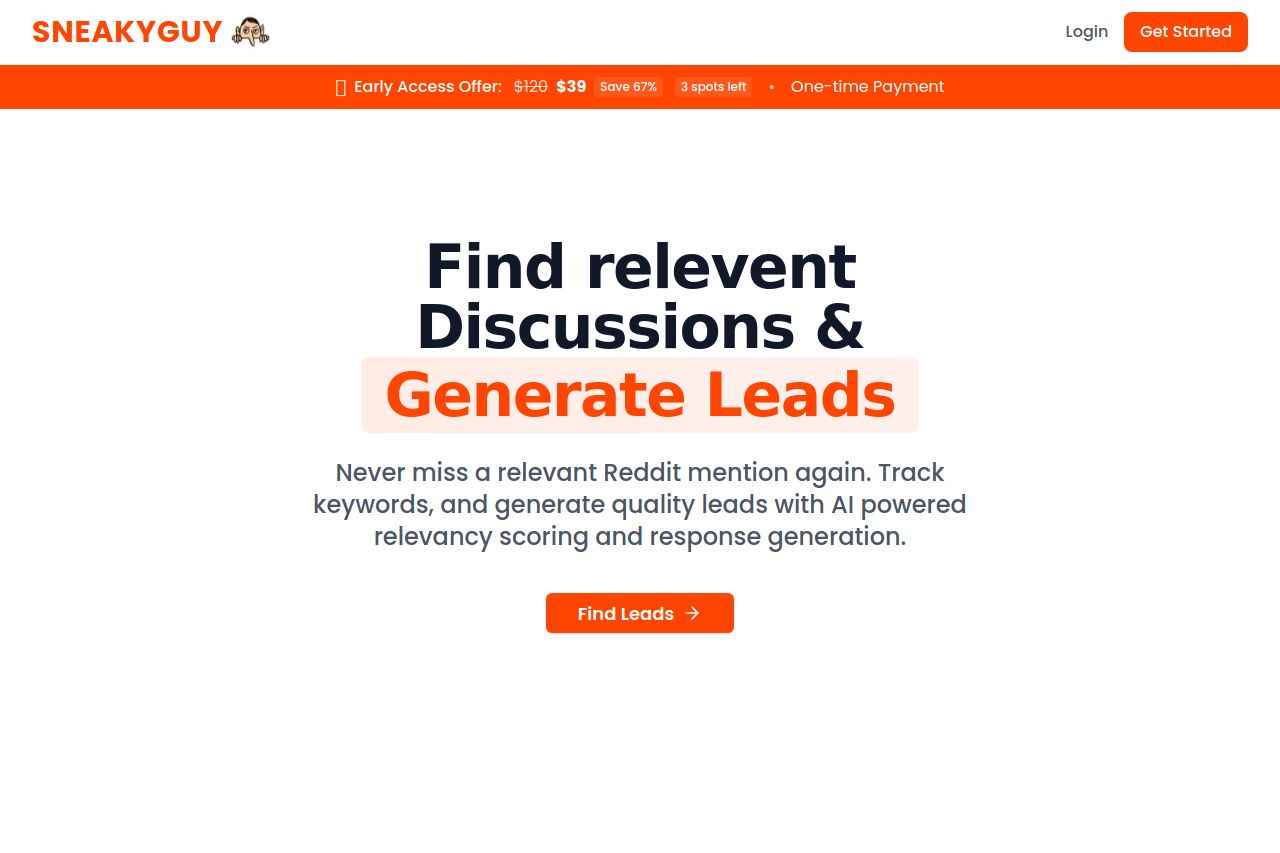
SneakyGuy's landing page starts strong with a bold color scheme and direct value proposition about lead generation through Reddit. However, the design falters with alignment and consistency issues.
The messaging is straightforward but a bit generic, lacking clarity about what exactly makes SneakyGuy distinct. Unfortunately, readability takes a hit due to inconsistent font sizes and ambiguous headings making navigation cumbersome. The page feels visually cluttered due to varying font weights and colors, impacting the design integrity.
In terms of structure, while there's a logical flow in demonstrating the problem vs solution, critical info like pricing is buried. Although CTAs are visually distinct, their actionability is undermined by repetitive wording and unclear placement.
The big issue is credibility. Despite positive testimonials, the lack of recognizable trust elements makes the site feel less legitimate. Without social proof or professional affiliations, it needs something to instill trust in new users.
- Streamline font sizes and weights for better consistency and readability.
- Enhance clarity in the value proposition; specify unique features.
- Incorporate trust elements such as badges or recognized logos.