kit.com
Landing Page Analysis

Summary:
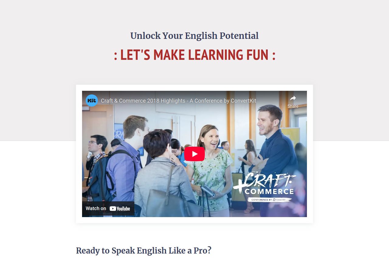
The landing page attempts to highlight the engaging and fun approach to learning English through TinkerEnglish. The headline makes a strong initial promise, but it lacks impact visually. Using a common YouTube video as the main visual is underwhelming. The copy does a decent job explaining benefits, but it’s overly verbose and could lose the reader's interest. There’s a consistent use of bold to emphasize key takeaways, which works to some extent, but could be pared back for improved clarity. The call to action is clear, although buried at the very end of a long scroll. The use of red for the CTA button helps it stand out, but it feels disconnected due to the generic placement. Overall, while the premise is good, the execution leaves much room for improvement, especially in terms of structure and focus on key selling points.
- Simplify and condense the text to keep engagement high.
- Move the CTA higher up the page to capture leads sooner.
- Use more original visuals that relate directly to the learning experience.