replit.app
Landing Page Analysis
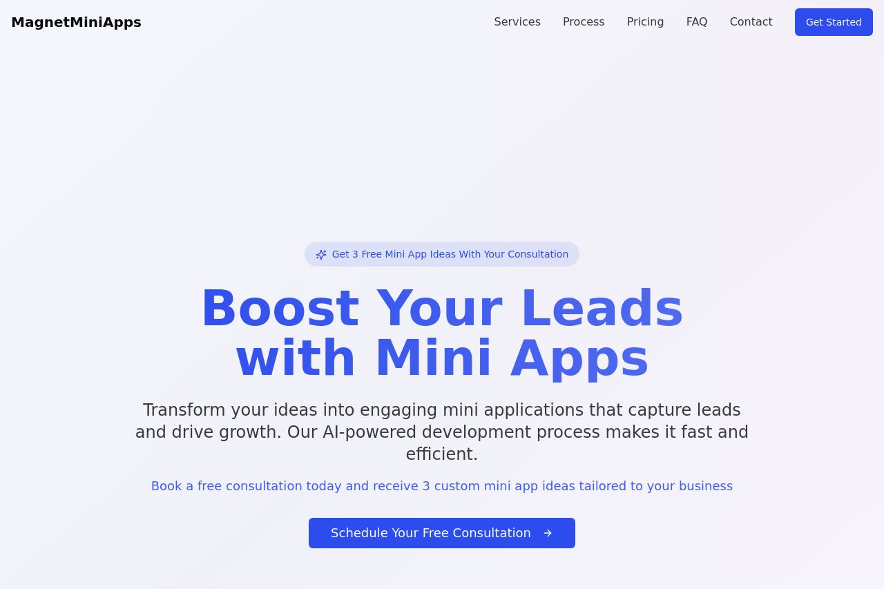
Summary:
The landing page for MagnetMiniApps is quite structured and clear, focusing on promoting the service of creating mini apps to boost leads. The hero section effectively grabs attention with a strong and direct value proposition: "Boost Your Leads with Mini Apps." The call to action is prominent and encourages immediate engagement with a free consultation offer. Design consistency is maintained across sections, especially in typography and color use, which is easy on the eyes and keeps the focus on content rather than distractions.
However, the page suffers slightly from a lack of depth in describing its offerings and the uniqueness compared to competitors. The features section could offer more specific client testimonials or case studies to add credibility and showcase effectiveness. Similarly, the CTA strategy could use a bit more urgency.
Overall, while the basics are well executed, enhancing specificity in certain areas could significantly improve engagement and user trust.
- Add specific client testimonials or case studies to enhance credibility.
- Introduce a sense of urgency in CTAs, such as limited-time offers.
- Include more detailed examples or previews of mini apps applications.