veganfun.nl
Landing Page Analysis
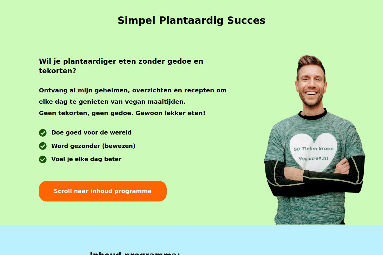
Ontvang al mijn geheimen, overzichten en recepten om elke dag te genieten van vegan maaltijden.Geen tekorten, geen gedoe. Gewoon lekker eten!
Summary:
Overall, the landing page has a friendly and inviting aesthetic that is well-suited to its target audience. However, it's let down by some serious issues in design and messaging.
The value proposition seems appealing at first glance, focusing on vegan meals and lifestyle benefits, but it's not crystal clear. The benefits are vaguely presented without directly addressing the audience's needs or pain points.
The design is inconsistent and lacks polish. The mix of bright colors and poor typography choices make the content harder to digest. The use of green and blue backgrounds with black text is visually jarring. The call-to-action buttons, though visible, aren't particularly enticing or emotional.
The content structure also needs work. The information hierarchy is muddled, with some key selling points buried under less critical content. The layout doesn't guide the reader's eye intuitively.
From a credibility standpoint, the website suffers from not having enough trust elements. Though some testimonials are present, the overall appearance doesn't exude trust or professionalism.
The CTAs are action-oriented but could stand out more. There’s a lack of urgency or compelling reason for immediate action, and repeated use of the same CTA phrase dilutes its impact.
Improvement areas include clarity in messaging, consistency in design elements, and a more logical flow of information.
- Clarify the main value proposition to make it more compelling and direct.
- Revamp the design for better consistency and visual appeal.
- Improve information hierarchy to make critical points more accessible.