hpforbiddenforestexperience.com
Landing Page Analysis
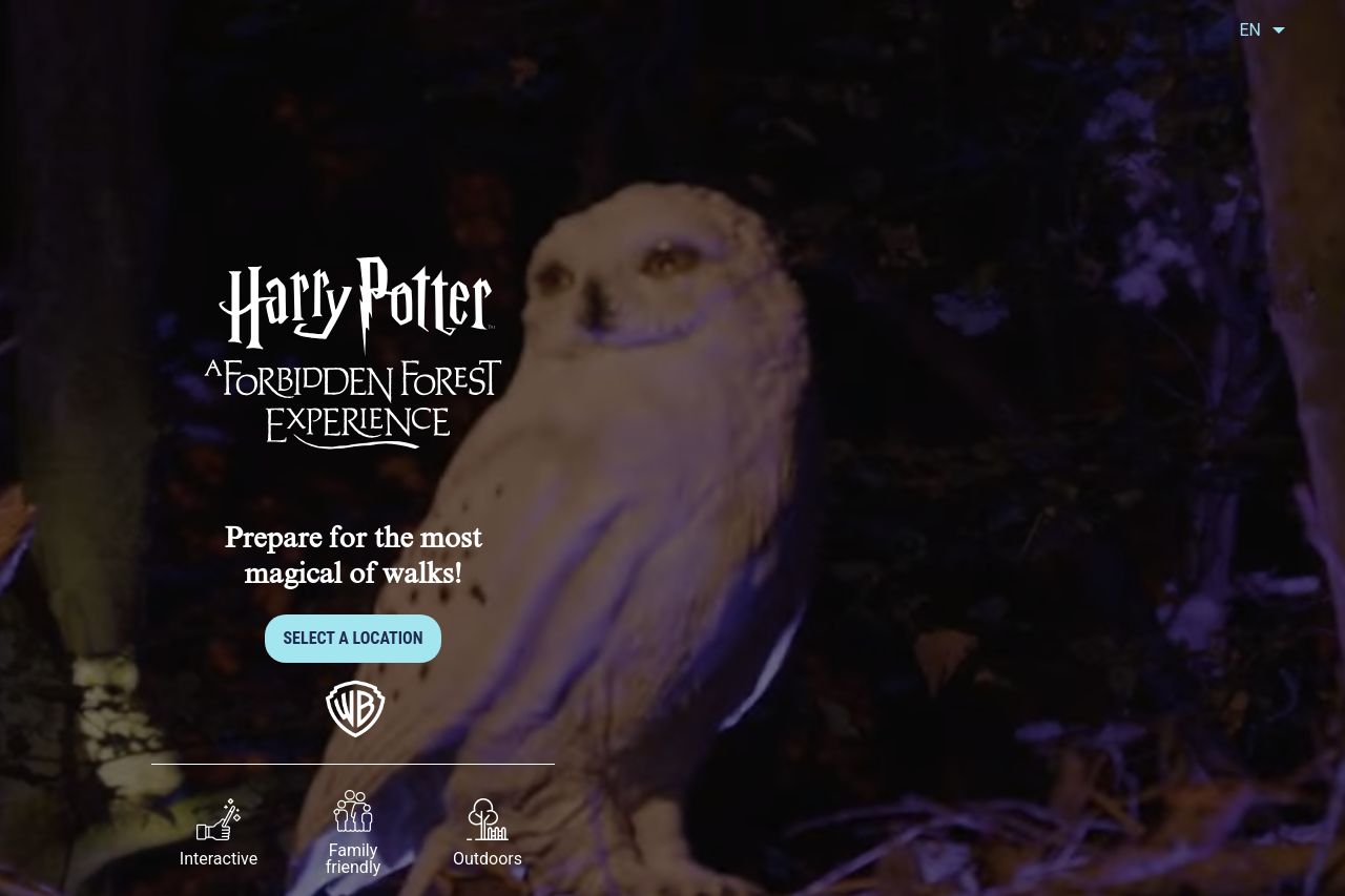
A nighttime experience filled with magical creatures and wizarding wonders from the Harry Potter™ and Fantastic Beasts™ films 🌑 Walk into the woods!
Summary:
The landing page is visually appealing with a strong theme aligned with the Harry Potter brand, which grabs the target audience's attention effectively. The atmospheric imagery helps create an enchanting vibe. However, the page lacks clarity on availability and ongoing experiences, as many locations are marked "experience finished." This can be a letdown for visitors looking for active events. The call-to-action "Select a Location" is somewhat obscured by its placement and doesn't stand out as much as it should. The text could be more dynamic and engaging and does not fully captivate the magical essence it aims to sell. Social proof and credibility elements are present but feel too subtle to feel impactful, especially if new visitors are trying to gauge the event's popularity.
- Revitalize content with updates on future events or active locations to maintain interest.
- Enhance CTA visibility by using contrasting colors and strategic placements.
- Include visitor testimonials or reviews to boost social proof and credibility.