synctools.io
Landing Page Analysis
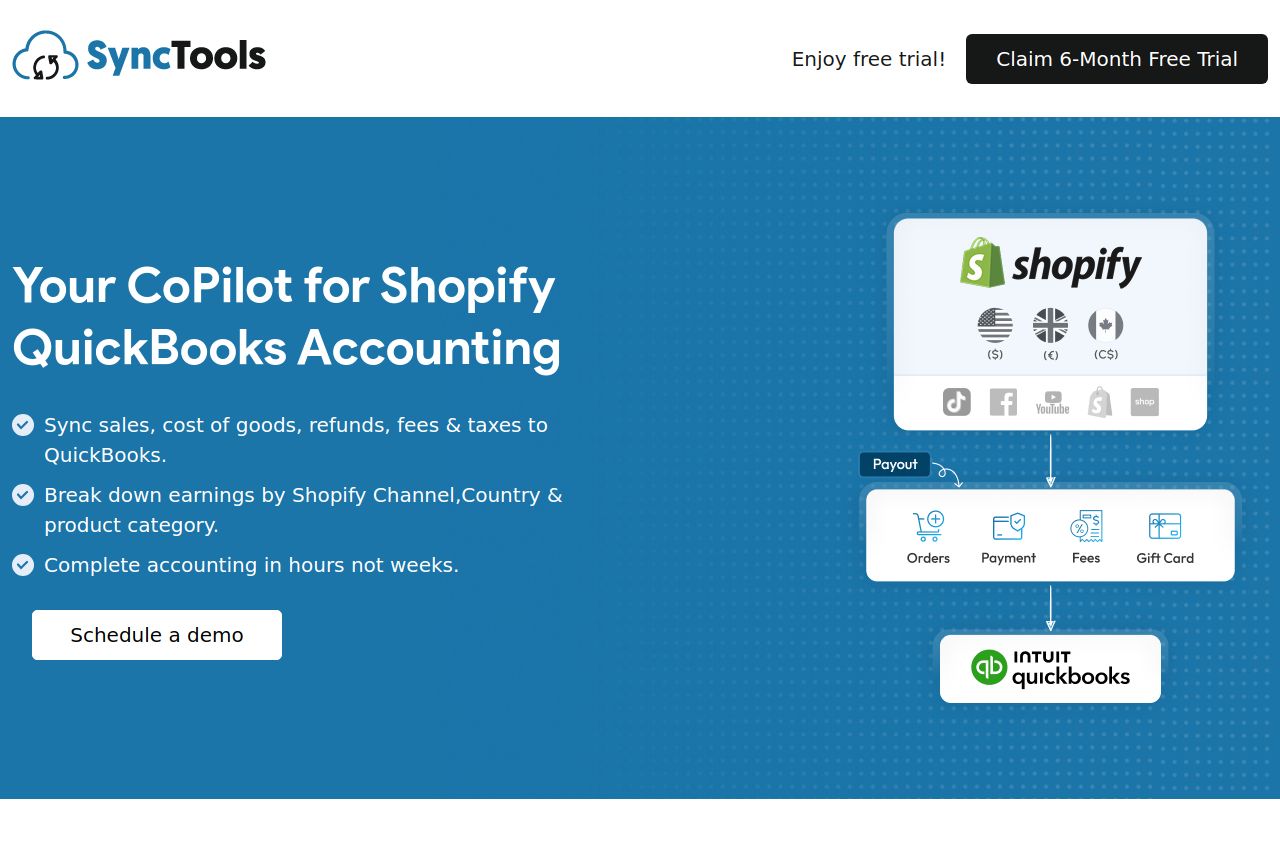
Integrate Shopify sales data with QuickBooks Online within minutes using SyncTools. Let's covert uncategorized Shopify sales payout data into organized summaries that reconcile seamlessly in QuickBooks Online. Try errorless accounting with Shopify QuickBooks Online integration.
Summary:
The landing page for SyncTools effectively conveys its main value proposition of simplifying Shopify and QuickBooks accounting. The messaging is clear for the most part, specifying the benefits and features with straightforward language. The visual design maintains consistency with a coherent color scheme and use of whitespace, but the frequent promotional banner (‘Get Early Bird Exclusive Offer! First 6 months free’) which appears across multiple sections can feel intrusive and repetitive, detracting from other key elements. The structure and navigation are well-organized overall, yet some sections might feel a bit too wordy or dense. Calls-to-action are clear, though the multitude of similar CTAs can reduce overall impact. Trust is bolstered effectively with partner logos and client testimonials. Overall, the page is readable and visually pleasing but can benefit from some decluttering and CTA refinement for improved user experience and conversion.
- Reduce the repetition of the 'Early Bird Exclusive Offer' banner to minimize distraction.
- Simplify the visual hierarchy of CTAs to focus users’ attention effectively.
- Break some text-heavy sections into bullet points for easier digestion.