talknotes.tech
Landing Page Analysis
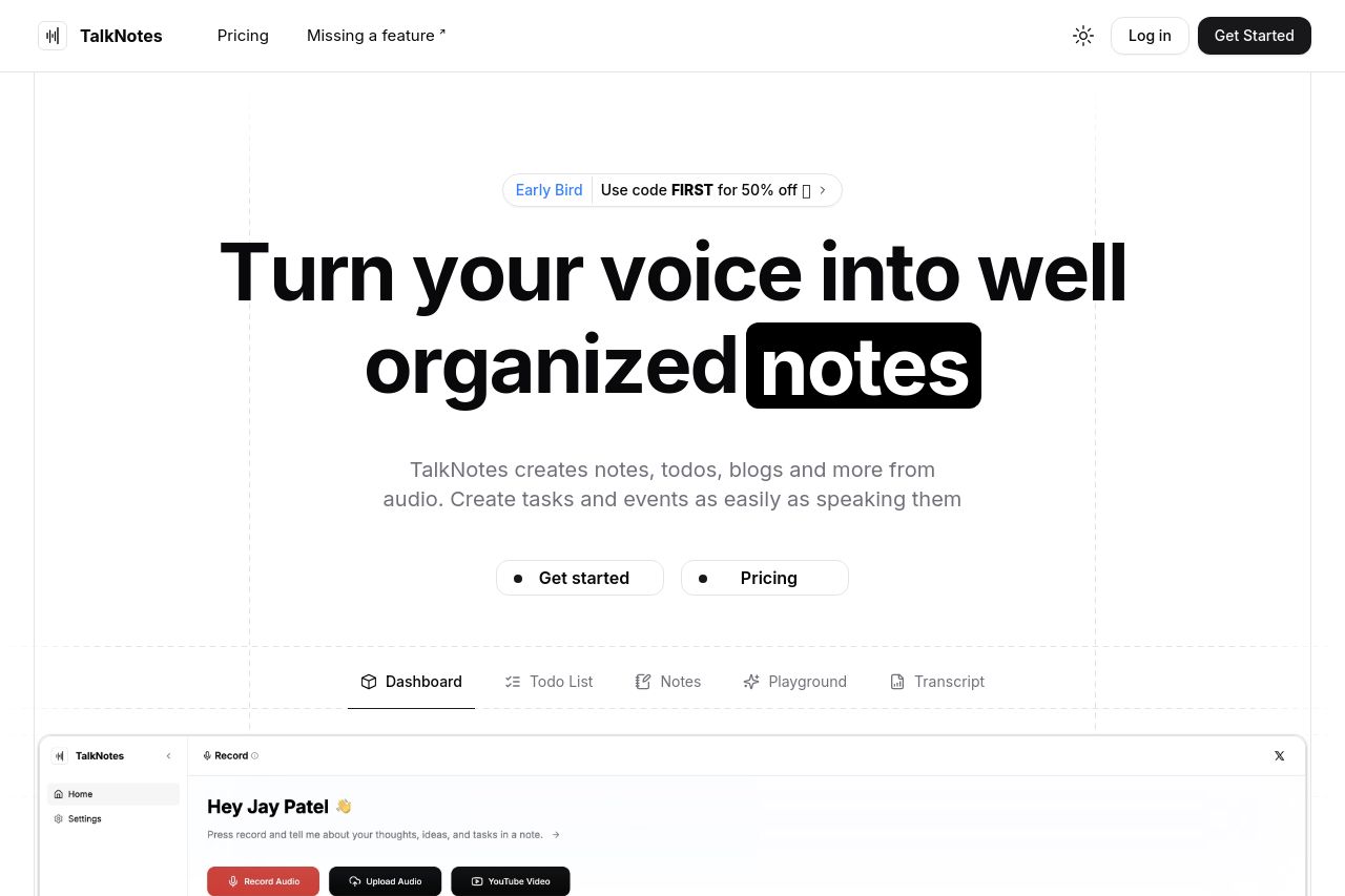
Turn hours of note taking into seconds. Record voice notes or upload recorded audio, and let the AI transcribe & structure them into actionable text. Create todo lists, notes, flashcards, transcripts, and more! Works in 100+ languages.
Summary:
The landing page for TalkNotes does a decent job of explaining the product's capabilities, with a strong emphasis on the ability to turn voice notes into written content. However, there's a lack of clarity in some areas, and the overall design is somewhat bland and uninspiring.
Messaging is alright but could be more targeted to different user segments. The call-to-action buttons are visible but lack urgency or enticing language. The readability and text simplicity is good, but the visual design is very minimalist, which might come off as plain rather than sleek. The structure is decent, but more dynamism in flow would improve the user's journey.
The credibility section has social proof, like the mention of trust and logos. The problem is a slight air of generic design, making it seem like just another service rather than something special.
Overall, the landing page works in communicating the basic details but could use improvements in engagement, vibrancy, and persuasion.
- Enhance the visual appeal with more dynamic design elements instead of plain and boring layouts.
- Refine the call-to-action language to create more urgency and interest.
- Tailor messaging more towards specific user segments for better audience alignment.