cerathrive.com
Landing Page Analysis
Start Thriving with Cera, the first FDA-listed Red Light Therapy device that supports the Gut-Brain Axis. This breakthrough therapy increases cerebral blood flow, reduces inflammation, and boosts mitochondrial energy. Discover the profound benefits for yourself with our premier Photobiomodulation Device, CeraThrive.
Summary:
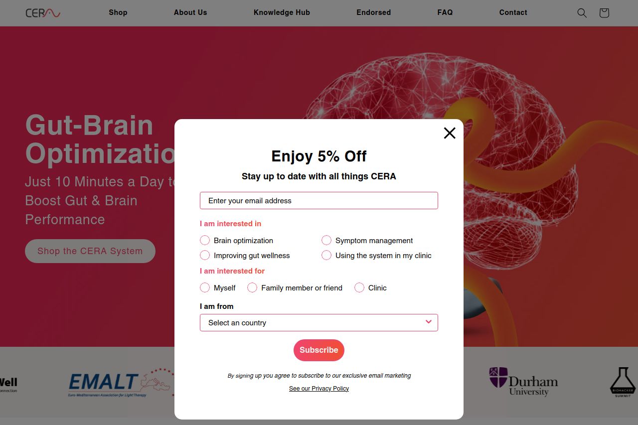
The landing page for CeraThrive feels cluttered with the excessive pop-up modals interfering significantly with user experience. The main message about "Gut-Brain Optimization" is clear, but the constant pop-up is a major distraction. The color scheme of red and white is consistent, which helps create a cohesive look, but might feel too aggressive for a wellness product. The typography is basic but readable; however, the text could use better formatting with more headers and animated elements to maintain interest. The CTA "Shop the CERA System" could be enhanced as it blends into the background too much. The site effectively uses social proof with reviews and testimonials, boosting credibility, but more visual variety could enhance interest. The content lacks a clear flow, with some sections dense with text that doesn't invite reading. The credibility section is strong with clear contact details, reflecting transparency.
- Reduce the frequency and size of the pop-up modals to improve user experience.
- Enhance the CTA buttons to make them stand out more, perhaps by contrasting colors or using shadow effects.
- Reorganize content for better flow; use more engaging headings and bullet points.