printify.me
Landing Page Analysis
45
Share on:
Summary:
35
Messaging
50
Readability
50
Structure
45
Actionability
55
Design
20
Credibility
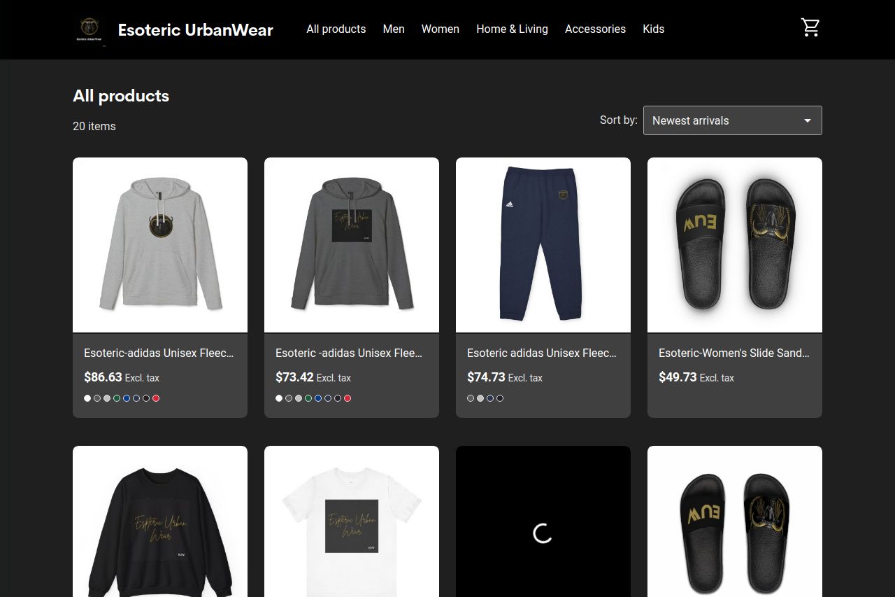
The page lacks distinctive features and fails to establish a clear brand identity. The black background along with the product images risks becoming monotonous without effective use of color contrast or visual hierarchy. The product names and descriptions are bland and uninformative, missing an opportunity to engage potential buyers or communicate any unique selling points. Additionally, there's no sense of urgency or encouragement through the CTAs, which are buried and generic, simply detailing prices without any enticing information. The lack of testimonials or reviews undermines credibility, and navigation could be smoother for a better user experience.
Main Recommendations:
- Enhance product descriptions with unique features and benefits.
- Include social proof elements like testimonials or reviews.
- Improve CTA design and placement to increase engagement.