blogdumoderateur.com
Landing Page Analysis
Tout savoir sur le développement web en 2025 : langages à connaître, nouvelles réglementations...

Summary:
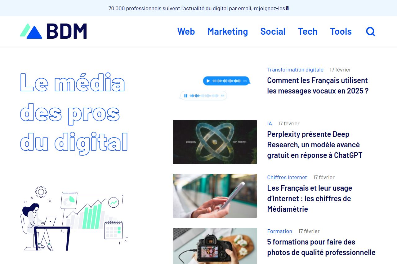
The landing page for BDM is visually clean and aims to attract digital professionals. However, it's a mix between a digital magazine and a resource hub, leaving a confusing purpose.
The tagline "Le média des pros du digital" tries to target digital professionals, but lacks a strong motivational hook. The content is packed, offering articles, tools, and events, yet the visual hierarchy doesn't emphasize key elements—resulting in a somewhat cluttered experience.
While the imagery is consistent, the CTA areas, like the subscription section, might not stand out sufficiently to prompt action. The color scheme is aligned with digital themes, but doesn't leverage contrast effectively to highlight crucial information.
The page's structure frays with sections that blend into each other, losing readers' attention. Though headings are present, they fail to guide efficiently through the wealth of information. Social proof is apparent with tools and articles, but lacks personal testimonials.
Overall, it has potential with strong professional alignment but misses impact due to bland CTAs and lackluster structural organization.
- Clarify the value proposition more explicitly to communicate benefits.
- Improve CTA visibility by enhancing contrast and prominence.
- Reorganize the structure to highlight important sections and guide the reader more effectively.