vusercontent.net
Landing Page Analysis
Summary:
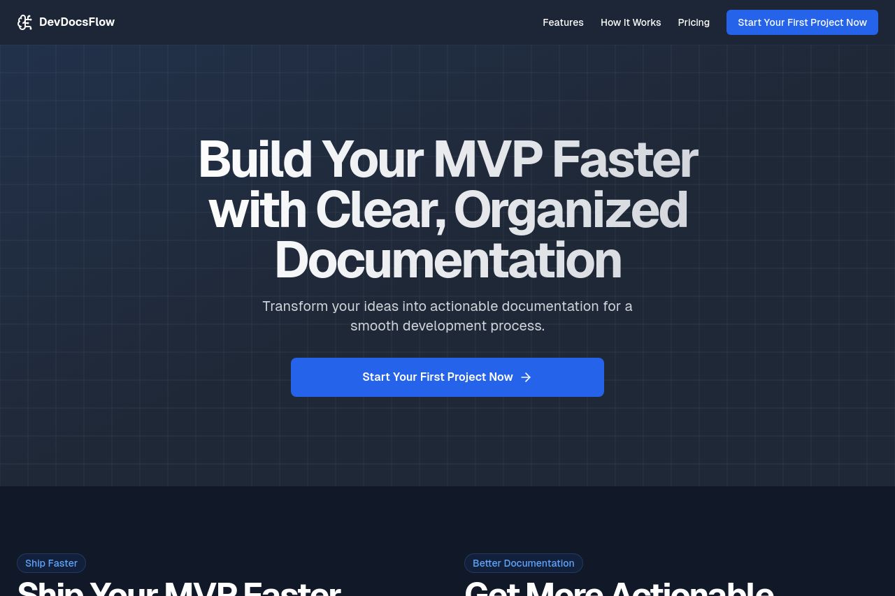
The landing page for DevDocsFlow is clear and straightforward, aiming to communicate a clear value proposition of building MVPs faster with organized documentation.
The headline is bold, but it could be more distinctive to grab attention effectively. The visual design is clean, but somewhat devoid of personality, relying heavily on a dark, predictable theme that lacks character. Consistency across sections is commendable, utilizing the same grid layout and iconography.
Call-to-action (CTA) buttons are prominent but lack variety or sense of urgency, which might not effectively push users toward conversion. Credibility elements like testimonials or recognizable logos are missing, which might cause trust issues in potential customers.
While the structure is logical, it could use more storytelling elements to avoid coming off as overly technical or bland. The pricing details are clear but could use additional highlighting, like customer benefits or comparative advantages over competitors.
Overall, this page performs functionally but struggles to leave a memorable impression or build immediate trust.
- Add testimonials or client logos to build trust.
- Incorporate more engaging visuals or color to enhance memorability.
- Use scarcity tactics or varied CTAs to increase conversion likelihood.