bimdesk.pt
Landing Page Analysis
Summary:
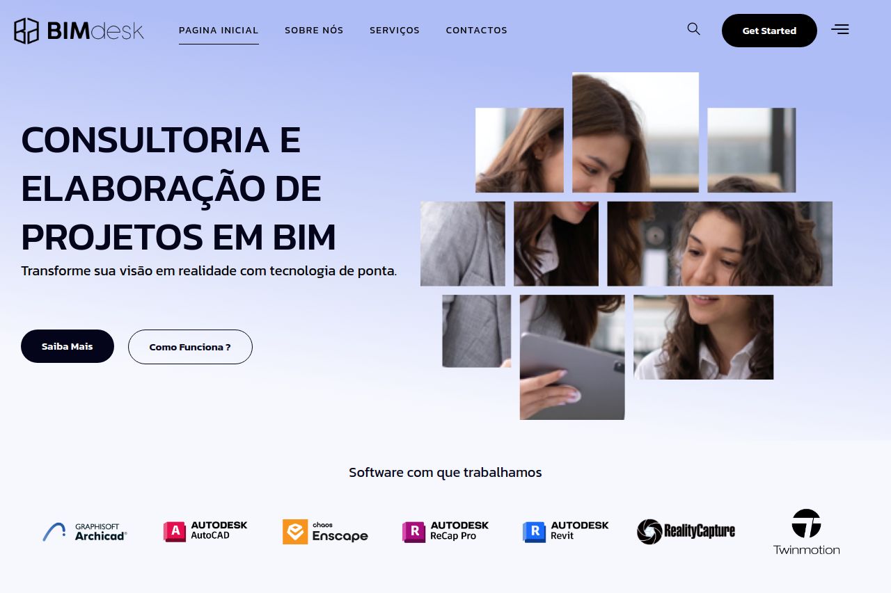
BIMdesk presents a professional yet somewhat uninspiring landing page. The overall design is clean but lacks a wow factor. The value proposition is clear: offering BIM solutions with cutting-edge technology. However, the engagement suffers due to the dry tone and sluggish readability. Sections are laid out logically, but the visual hierarchy is weak, and important elements don't stand out. Although the page uses good contrasting colors, the typography is monotonous, which might bore the user. Social proof is okay but could be stronger, adding more weight to credibility. CTAs are placed in visible spots but are lacking punch due to generic wording and lack of urgency. Overall, while the site is decent, it lacks the spark that would turn browsing into conversion. Let's kick it up a notch!
- Use cohesive and vibrant visuals to enhance brand identity.
- Revamp CTAs with more engaging and specific language.
- Incorporate more social proof elements such as testimonials or case studies.