usejuno.ai
Landing Page Analysis
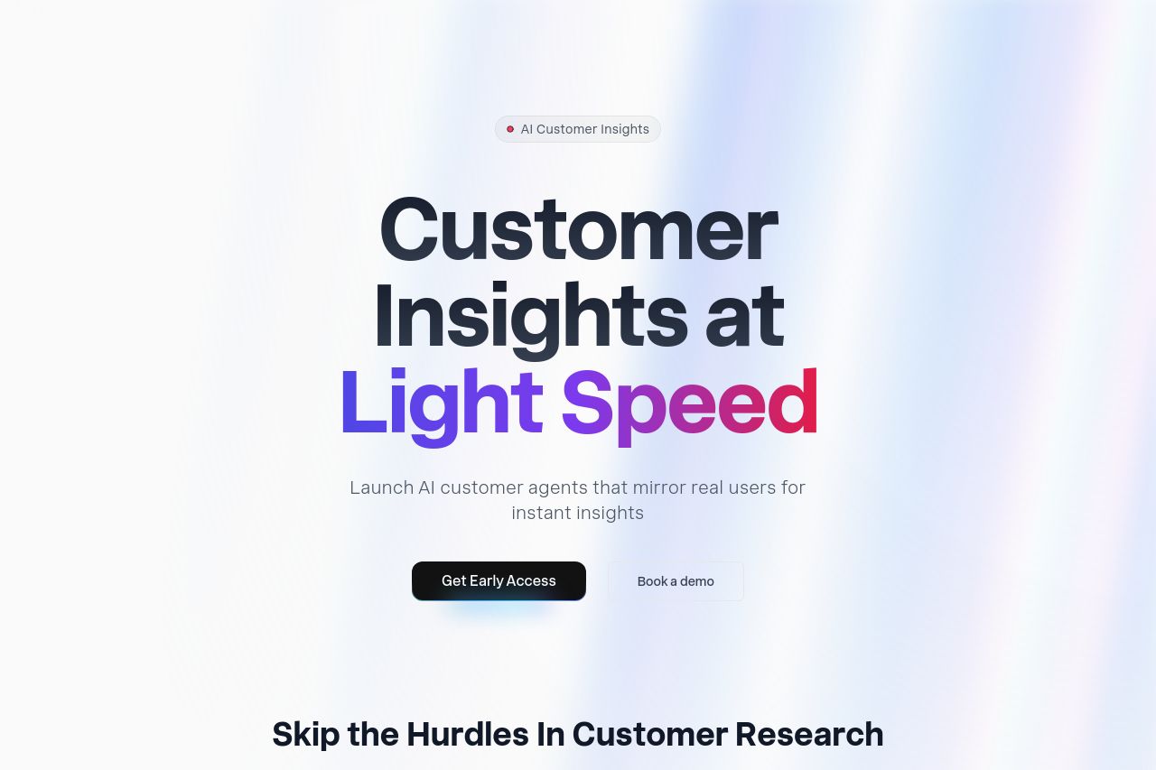
Create AI agents that mirror real customers and streamline feedback workflows
Summary:
The landing page makes a strong impression with bold typography and a clean design, effectively communicating the message of "Customer Insights at Light Speed." The main value proposition is clear and visually impactful. However, the visual clarity suffers from a reliance on dark backgrounds and tiny text blocks that can be hard to read. The call-to-action buttons like "Get Early Access" and "Book a demo" are well-placed but lack urgency. Consistency across the design is good with cohesive iconography and color schemes that align well with a tech-savvy B2B audience. However, more specific examples and demos would help clarify the product's capabilities. The use of AI buzzwords feels a bit overdone without detailed backing, potentially alienating a sophisticated audience looking for detailed explanations. Social proof is present but not abundant enough for B2B credibility. Increased testimonials and case studies could build trust. Overall, the user journey could be smoother, especially with clearer section headings and flow in the narrative, leading the user more seamlessly to action.
- Include more detailed case studies or testimonials for credibility.
- Add explicit examples or demos to reinforce product capability.
- Enhance the urgency and specificity of CTA buttons.