testcolorimetria.com
Landing Page Analysis
¿Listx para brillar? Nuestro análisis de colorimetría te revela tu paleta perfecta en segundos. Informe completo, consejos de moda y más. ¡Cambia tu estilo hoy!
Summary:
The webpage creates a strong impression with colorful visuals and clear focus on delivering a personalized color analysis service. However, it struggles with some inconsistencies and could further refine its messaging to better target its audience.
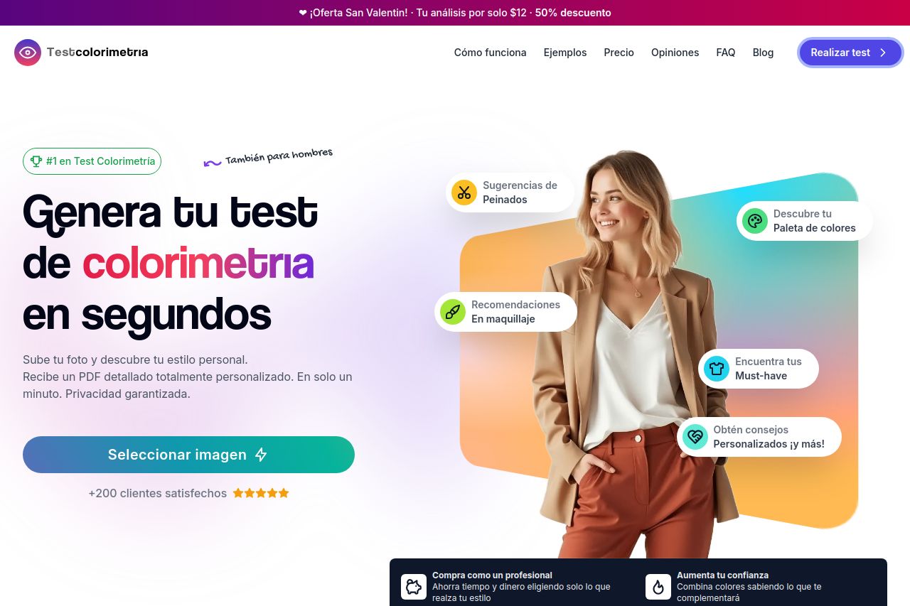
The headlines, such as "Genera tu test de colorimetría en segundos," are straightforward, but some supporting text feels vague and lacks detailed explanation on how the service actually functions. Design-wise, the page excels with its vibrant color palette but could be improved by ensuring all color choices enhance, rather than distract from, the main message.
The hierarchy feels slightly off, with important information such as the pricing not immediately visible without scrolling. Although it uses testimonials well to build credibility, more detailed use cases or examples could further solidify its appeal.
- Highlight the pricing section more prominently so visitors can quickly see the value.
- Refine the messaging to clearly explain the benefits and process of the service upfront.
- Ensure all colors used in the design support readability and don't distract from key messages.