masterhackers.com
Landing Page Analysis
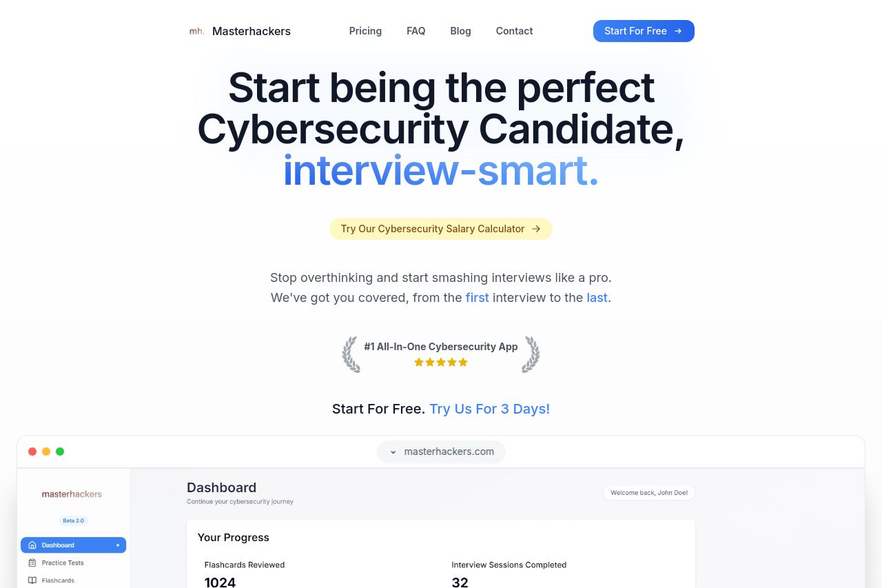
Be the best cybersecurity candidate with Masterhackers. Prepare certifications, use our flashcards or practice our mock interviews.
Summary:
The landing page is solid but doesn't fully tap into its potential. The headline "Start being the perfect Cybersecurity Candidate, interview-smart" is catchy, yet it lacks a tangible focus on the unique benefits. It needs clearer pointers about what makes this platform exceptional. This over-reliance on flashy words like "ass-kicking" can alienate those who prefer a more professional tone. The layout looks clean, but there's wasted space, and some elements fail to pop. Though visuals are decent, the call-to-action buttons don't scream urgency or necessity. The "Start For Free" is too generic and not compelling enough. Social proof is present with testimonials and logos, but they should highlight more specific success stories to build trust further. The site maintains decent readability with contrast and typography, but certain text blocks are too long and might deter quick reads. Overall, it's close to being great, but needs strategic tweaks to truly shine.
- Clarify unique benefits in the headline or subheadline.
- Make call-to-action buttons more compelling and specific.
- Shorten text blocks for quicker readability.