buildmvpfa.st
Landing Page Analysis
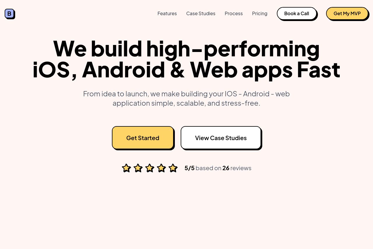
Summary:
The landing page clearly communicates its value proposition: building apps quickly. However, the style is very basic, and it feels like it’s trying a bit too hard to be trendy with its pastel colors and large fonts, which might not appeal to everyone. The use of CTA buttons like "Get Started" and "Calculate Your Price" is specific, but scattered CTAs dilute the focus. Social proof is decent with ratings and testimonials, but the consistency and professionalism feel slightly off, like it’s not fully trustworthy yet. Sections follow a logical flow, but the navigation isn't strong, forcing users to scroll through long sections. The color palette lacks contrast, making some text hard to read, especially against light backgrounds. The structure is functional but unexciting, which might leave visitors unconvinced. Overall, it's decent, but it needs refinement in design and messaging to truly persuade and capture attention.
- Enhance the color contrast for better readability, especially for text against the pastel background.
- Improve the consistency and professionalism of the design to build trust.
- Revamp CTA placements and text to sharpen focus and guide users effectively.