noswag.io
Landing Page Analysis
Streamline API testing using noSwag: Convert API specs into auto scripts, run on a unified platform. Perfect for startup CEOs and CTOs, it cuts QA engineer workload.
Summary:
The landing page makes a good effort at presenting a streamlined solution for test generation but falls short in several key areas.
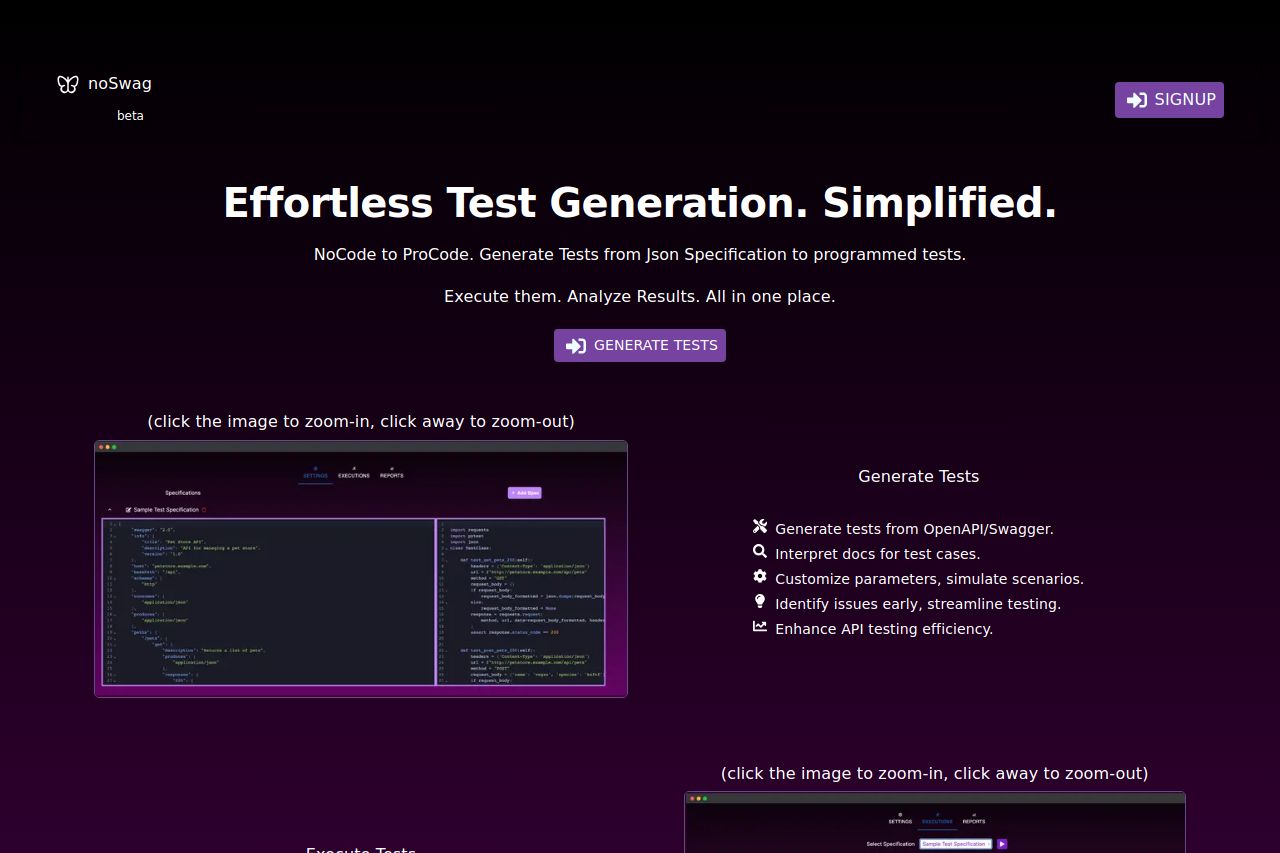
The value proposition is somewhat clear, emphasizing effortless test creation, but it lacks strong, direct language that can resonate with the B2B audience. The imagery supports the text by showcasing the interface, which is useful, but the visual hierarchy is poorly managed, making the section feel overwhelming.
Color contrast could be improved, particularly as the purple color scheme doesn’t make the call-to-action buttons stand out. The features are laid out in a grid, which is visually tidy but lacks thorough explanations on how each feature benefits the user.
The navigation flow is straightforward, moving from test generation to execution and results monitoring, but without distinct heading contrasts, it’s easy to lose track. The credibility factor is low due to a lack of social proof, such as client testimonials or partner logos.
CTAs are present but dull, lacking urgent language to prompt immediate action. The offer of a free trial is buried in the footer; it would be more effective if highlighted earlier in the journey. Overall, the site needs refining in messaging clarity, action-oriented language, and visual hierarchy to truly appeal to its target audience.
- Increase contrast for CTA buttons to make them stand out.
- Include customer reviews or client logos for credibility.
- Refine messaging to be more action-oriented and specific for B2B audience.