checkhub.io
Landing Page Analysis
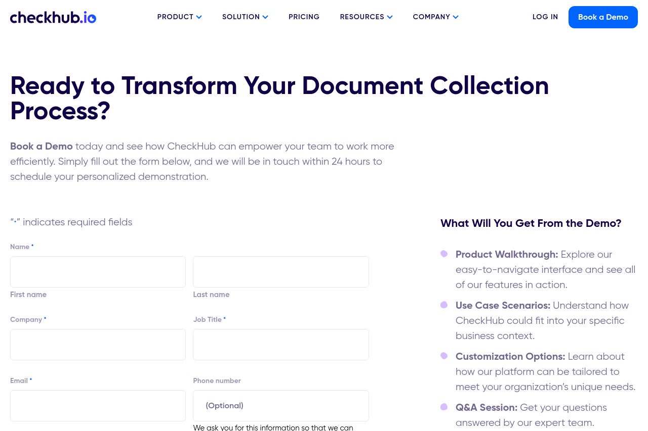
Discover how CheckHub can streamline document and data collection for your business. Book a demo today to see our automation tools in action and boost efficiency!
Summary:
The landing page cleanly outlines the purpose of booking a demo with CheckHub, appealing to a professional B2B audience. However, the main value proposition feels buried within the text rather than being highlighted at the top. The form fields are clear but a bit lengthy, which could deter users. The sidebar effectively supplements information without being overwhelming. There's solid use of color consistent with branding, but the overall design lacks distinctive visual hierarchy, making important elements blend into the background. The presence of client logos adds credibility but could be given more prominence. Calls to action are present but could be more compelling. While the content is tailored towards its audience, more specific examples or testimonials could enhance audience alignment.
- Highlight the main value proposition more prominently at the top.
- Enhance visual hierarchy to better guide user focus through font sizes and colors.
- Turn the call to action text into something more action-oriented like 'Transform Your Process Now'.
- Provide user-specific testimonials to enhance credibility.