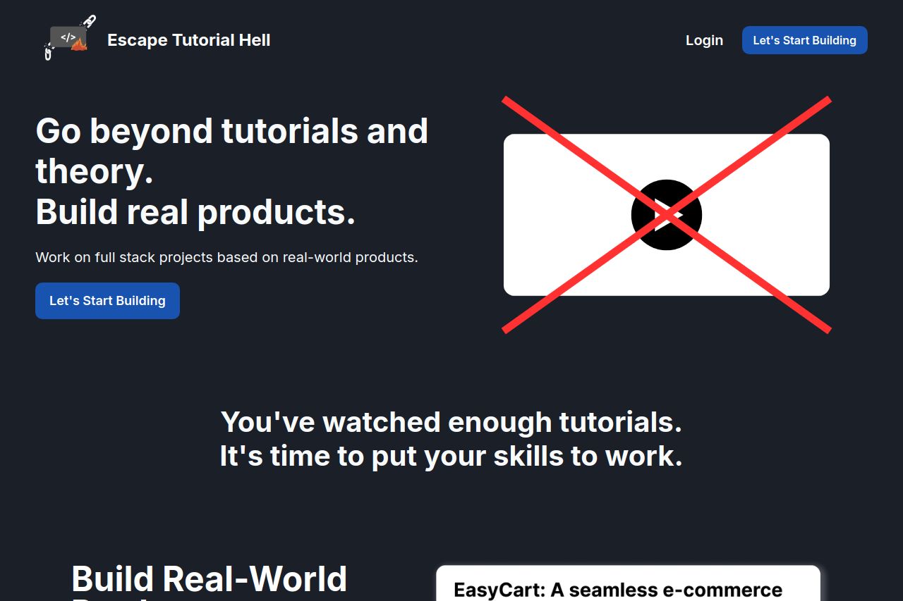
escapetutorialhell.com
Landing Page Analysis
undefined

Summary:
The landing page for Escape Tutorial Hell has some strong elements, but there are critical areas needing improvement. Messaging is clear with a straightforward value proposition focusing on practical skills, and the tone matches the target audience. However, the visual hierarchy is weak, lacking dynamic elements to guide the eye effectively. Colors could be better used to highlight important sections. The overall design is consistent, yet a bit dull and could benefit from engaging visuals. Actionability is mediocre, with a CTA that’s noticeable but lacks urgency or incentive. Information flow is logical but can be more engaging with stronger narrative connections. Additionally, social proof is non-existent, which hurts credibility. Typography is decent, making it readable, but the layout is too static and traditional for a tech-focused audience. Pricing is clear, though the perceived value could be boosted with more emphasized benefits. Contact information is present for transparency, but it misses interactive features like chat support.
- Enhance credibility by adding testimonials or client logos.
- Improve visual hierarchy with more engaging images and diverse color usage.
- Create a sense of urgency in the CTA to encourage action.