germanised.com
Landing Page Analysis
Germanised provides precise free guides for Moving to Germany, Living in Germany, culture, education, career, the latest news around you for expats, and many more.
Summary:
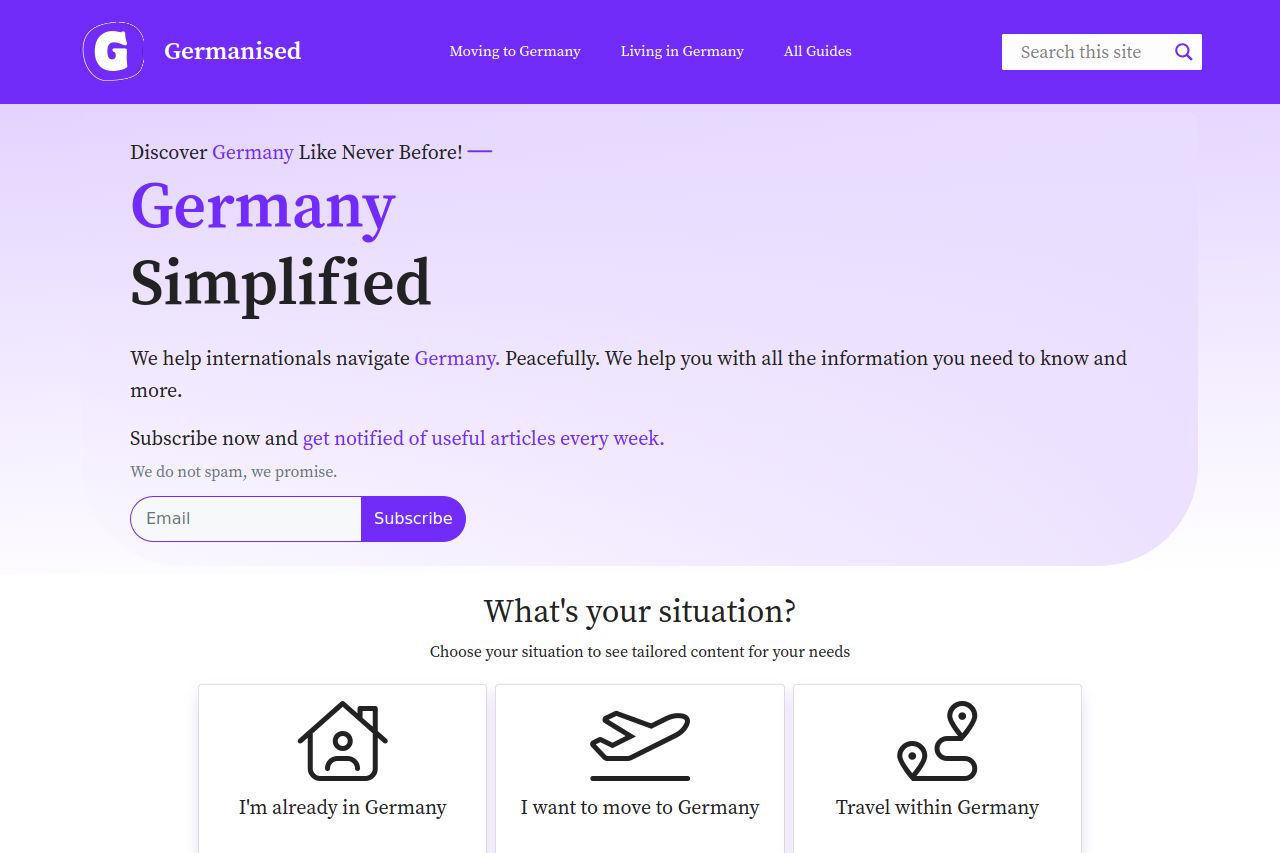
This page does a decent job of presenting its purpose at a glance, with the bold, eye-catching headline "Germany Simplified," suggesting the focus on guiding newcomers to Germany. The color scheme is cohesive, using purples that harmonize but offer little contrast between elements, which can make CTAs like the email subscription button hard to notice at a first glance. The messaging is clear but could dig deeper into the value proposition to entice visitors more. There's no immediate visual hierarchy that effectively guides the user from one part of the page to another, leading to potential confusions in reading flow.
The structure lacks punch, with sections feeling stripped down due to their generic headings like "What's your situation?" and "Search." Additionally, the email form isn't particularly prominent, nor is there urgency, diminishing its effectiveness. The inclusion of standardized icons does little to differentiate the user journey between sections. Despite the professionalism in design, further coherence in font sizes and making CTAs more visually engaging would enhance the user experience.
The credibility section is lacking since there's no visible trust elements like testimonials or partner logos. Also, the footer's layout could be revisited to ensure important navigational elements don't feel crammed or too minimalistic.
- Enhance the email subscription CTA by increasing its contrast and possibly adding urgency.
- Improve visual hierarchy by varying font sizes and weights more distinctively.
- Incorporate trust elements such as testimonials or client logos.