google.com
Landing Page Analysis

Summary:
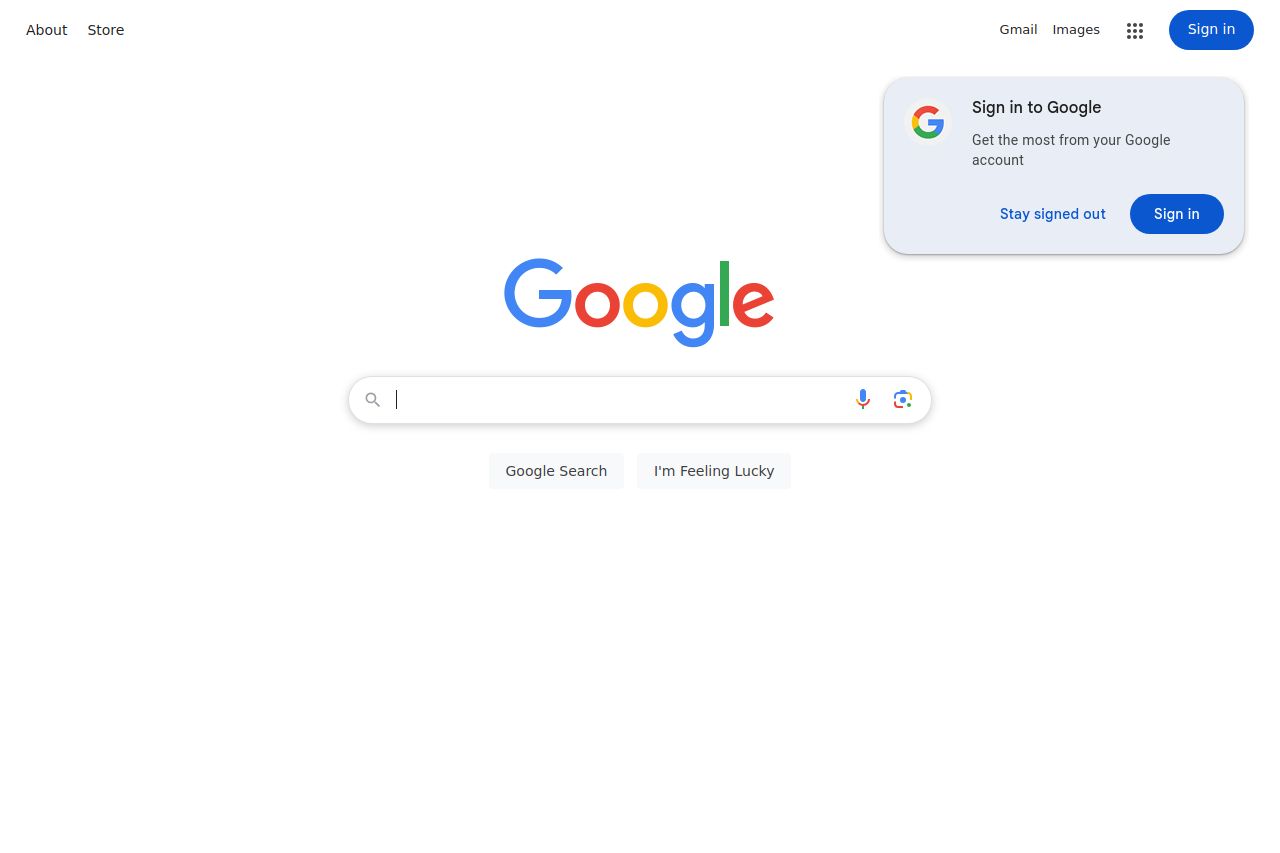
The Google homepage is a masterclass in simplicity and minimalism. Its clean white background puts the focus entirely on the colorful, instantly recognizable logo and the central search bar, which is the primary function of the page. The prominent and straightforward Call to Action buttons "Google Search" and "I'm Feeling Lucky" are well-positioned. However, the sign-in prompt floating to the side could be a slight distraction. The design ensures that nothing distracts from the primary use of the page: searching.
A major strength lies in its ease of use and visual clarity. The information hierarchy is spot on—nothing competes with the search bar for attention. It relies heavily on established brand recognition, so there is no need for traditional marketing value propositions or social proof on this page. The color scheme is consistent and supports brand identity, with the calm white background making the colorful logo pop. Clarity and simplicity come at the expense of offering some advanced user-facing features more visibly, like personalization options pre-sign-in.
While there's practically nothing to improve regarding design and functionality, some elements could potentially enhance user experience. The page could consider subtly incorporating notifications or personalized user prompts post-login within the main body instead of the overlay. Still, overall, the page’s success lies in its straightforward, distraction-free user experience.
- Consider integrating subtle user prompts or notifications post-login to enhance engagement.
- Ensure that the sign-in prompt does not distract from the main search function.