myeasyorders.com
Landing Page Analysis
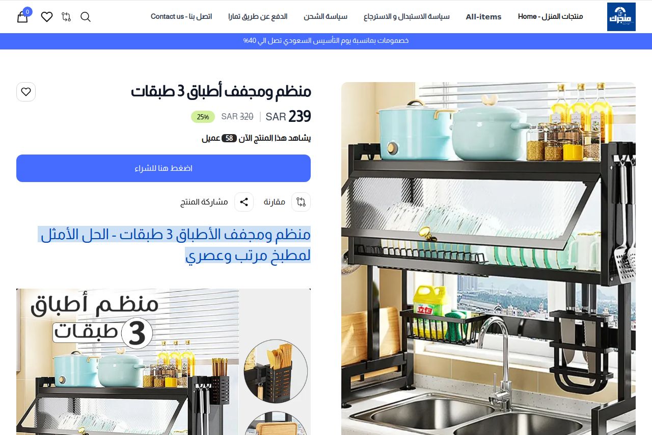
منظم ومجفف الأطباق 3 طبقات - الحل الأمثل لمطبخ مرتب وعصريودعي الفوضى وحولي مطبخك إلى مساحة أنيقة مع منظم الأطباق العملي :-3 طبقات فائقة السعة خزني أطباقك وأدوات المطبخ بترتيب يمنحك راحة بصرية ووظيفية.- حمل حتى 75 كيلوجرام: متين ومصمم من مادة البولي كربونات عالي الجودة لتحمل الأوزان الثقيلة.- حماية 360 درجة من الغبار:** أبواب شفافة محكمة تبقي أطباقك نظيفة دائمًا.- تناسب جميع الأحواض: مثالي للحوض الفردي أو المزدوج (حتى 33 بوصة) مع مساحة داخلية واسعة. مميزات ستدهشك- تصميم عصري بأبواب شفافة تظهر محتويات الخزانة وتضفي لمسة جمالية.- مساحة مخصصة لحامل السكاكين مع 3 أرفف متدرجة الارتفاع.- مقاوم للاهتزاز والتشوه والميل حتى مع الاستخدام اليومي.- سهولة الوصول إلى الأطباق دون عناء.تفاصيل سريعة- الأبعاد: 84.8 سم × 29.9 سم × 81.7 سم (مقاسات مثالية لمعظم المطابخ).- اللون: تصميم عصري بألوان متناسبة مع ديكور مطبخك.- التركيب: جاهز للاستخدام فورًا دون حفر أو تعقيدات.اطلبوا الآن واستمتعوا بمطبخ مرتب وانيقمطبخك يستحق الأفضل... اختاروا الترتيب بلمسة عصرية
Summary:
The landing page tries to convey a clear message about a 3-tier dish rack, focusing on its practicality and durability. However, the layout is cluttered, making it hard to follow the key selling points. The text is crowded and lacks hierarchy, overwhelming visitors with a wall of text instead of guiding them through the main points. The images do support the product description but are not leveraged effectively to create a visual narrative. The call-to-action is repeated but doesn't stand out due to similar styling to other elements. Trust elements like warranty and free shipping are present, helping build credibility, yet the lack of testimonials or reviews might undermine that effort. Overall, while the product itself is potentially appealing, the page presentation could be much stronger.
- Simplify the text content and use bullet points for features.
- Make the call-to-action button more visible by changing its color.
- Add customer testimonials or reviews to enhance trust.
- Improve text hierarchy with headers and sub-heads to guide readers.
- Optimize the layout to reduce clutter and improve readability.