golfsmeden.dk
Landing Page Analysis
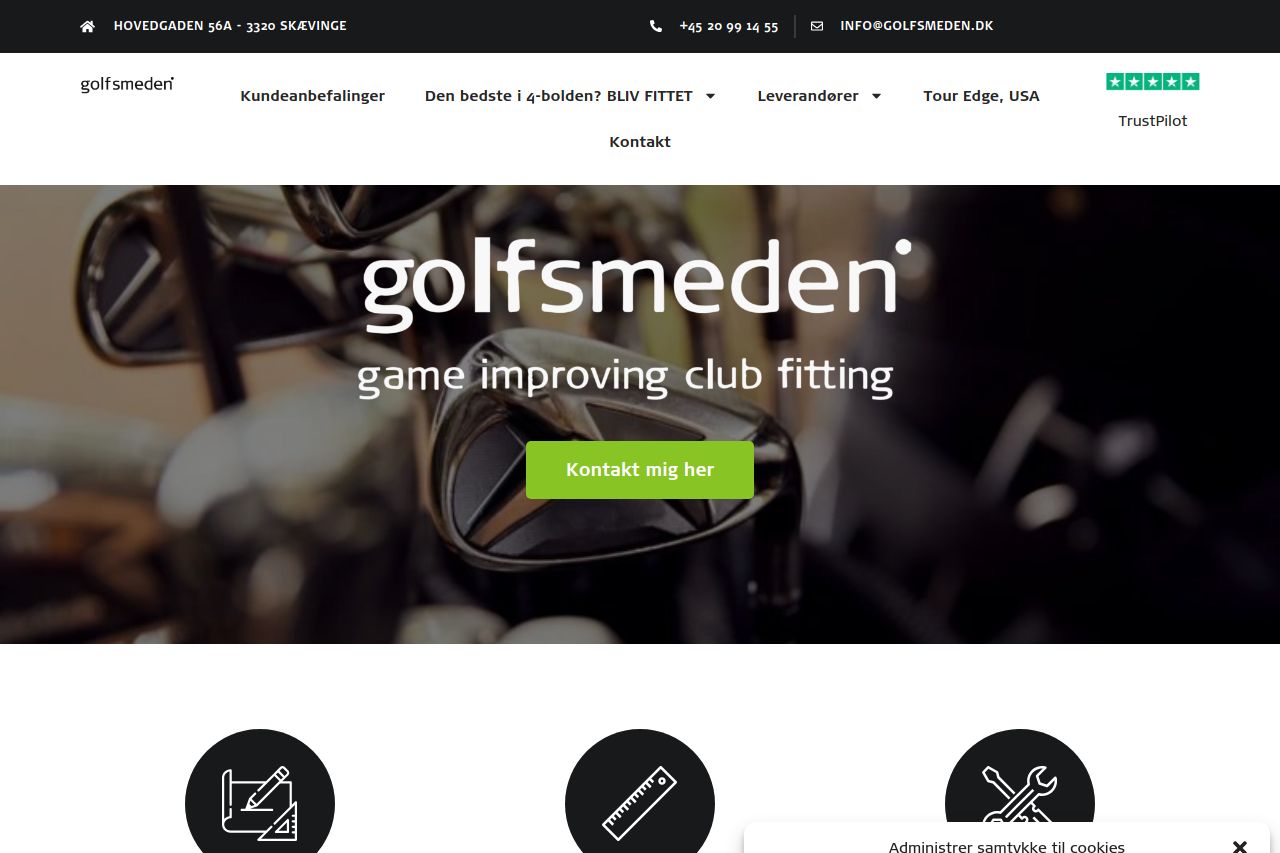
Club fitting hos Golfsmeden, Skævinge. Få tilpasset dit golfsæt til dig og dine specifikationer. Minimér tolerancer og få mest ud af din golfoplevelse.
Summary:
The Golfsmeden landing page makes a solid attempt to communicate its service of improving golf club fittings. The use of a golf-inspired aesthetic sets the stage well for the target audience. However, the page lacks a distinct visual hierarchy, making key information blend into the background. The call-to-action buttons, though present, don't pop out against the other elements. Messaging is another area that falters, with a tone that could be more engaging and specific to differentiate from competitors. The readability of the text is hindered by slightly dense paragraphs and inconsistent typography choices. On the brighter side, the site establishes credibility with a TrustPilot badge and detailed contact information. Design consistency is generally maintained, but it doesn't do enough to elevate the design to a professional level. Overall, more strategic enhancements in messaging, design, and actionability could substantially improve the site's effectiveness.
- Enhance the visual hierarchy by using different font sizes and weights for headings and key points.
- Improve CTA visibility by using contrasting colors and bigger buttons.
- Tone down text density and break up paragraphs to improve readability and engagement.
- Focus on clearer, more direct messaging that specifically addresses the target audience's pain points.
- Use more vibrant images and visuals to support the text and engage users better.