solopeduli.com
Landing Page Analysis
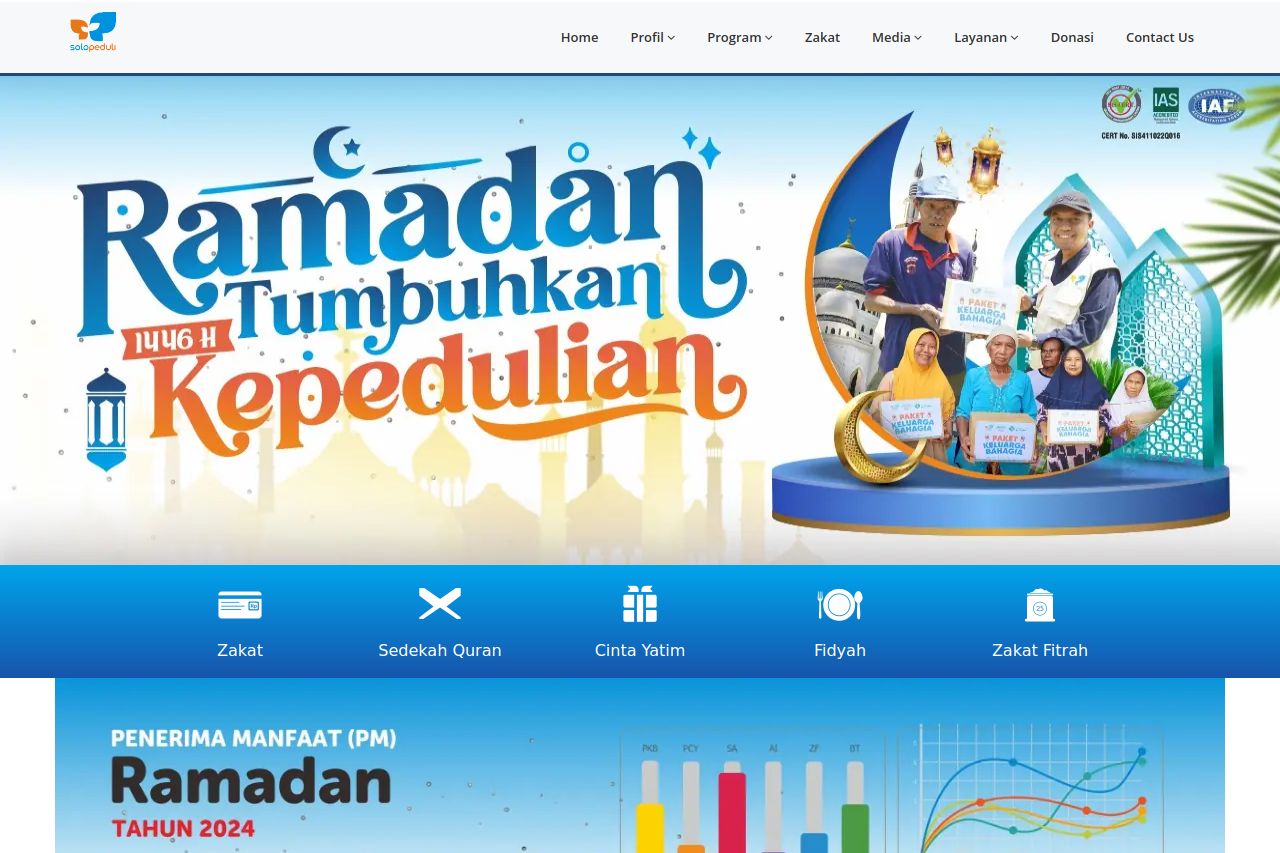
Solo Peduli – Lembaga terpercaya sejak 1999. Program Ramadhan amanah, profesional, dan teraudit. Tunaikan Zakat Fitrah & Maal dengan mudah dan berkah!
Summary:
The landing page uses bright colors that are eye-catching but might be overwhelming. The main value proposition related to charity and Ramadan is somewhat clear, yet lacks direct, attention-grabbing headlines. The audience is broad but not precisely defined, which might dilute the message's impact.
Visually, the page suffers from inconsistency in layout and design elements, making it appear cluttered in places. Typography is basic but doesn't effectively organize information to support readability. CTAs are present but could be better placed for enhanced user flow. Social proof elements like logos and images bolster credibility, but more structured transparency can improve trust.
Navigation needs stronger headings to aid users in quickly scanning for relevant sections. While the tone is consistent, it could further enhance engagement with more persuasive language. Overall, visual and structural tweaks are essential to improve user experience and drive conversions.
- Refine and clarify the main value proposition with direct, compelling headlines.
- Improve the placement and attractiveness of CTAs to guide user action.
- Enhance visual consistency in terms of layout and design elements.