hwk-stuttgart.de
Landing Page Analysis
Als Selbstverwaltungseinrichtung des Handwerks vertreten wir die Interessen von fast 30.000 Handwerksbetrieben in der Region Stuttgart.
Summary:
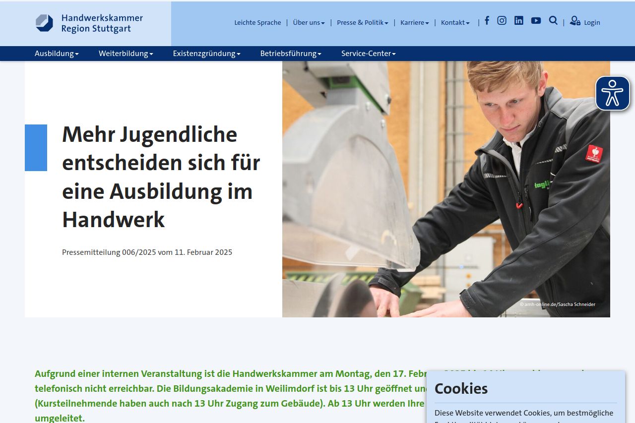
The website for Handwerkskammer Region Stuttgart is a mixed bag. The layout feels cluttered, and the critical information can be difficult to spot immediately. The current design seems too busy with elements scattered throughout like the cookie settings popup that occupies too much screen space. The hero section doesn't immediately convey a strong message, and there's more focus on text than on engaging visuals.
Readability is decent but unexciting, with basic typography that's serviceable but lacks flair. The contrast between text and background usually works, but sometimes it blends too much, affecting legibility.
Design consistency is lacking; the site feels like a patchwork. Font sizes and styles are not well-differentiated, making it harder to digest information. The sheer volume of navigation options can be overwhelming and interrupts the user journey.
On the plus side, there are clear sections for different topics, but these could be better structured and more visually appealing. Credibility is strong, with clear contact information and trusted branding elements.
- Improve visual hierarchy with better font sizes and styles.
- Streamline navigation elements to reduce clutter.
- Redesign the hero section to communicate more effectively with stronger imagery.