kameryck.nl
Landing Page Analysis
Beleef dieren van dichtbij op Kinderboerderij Oortjespad in Kamerik. Een unieke ervaring met speelvoorzieningen en natuur, ideaal voor gezinnen!
Summary:
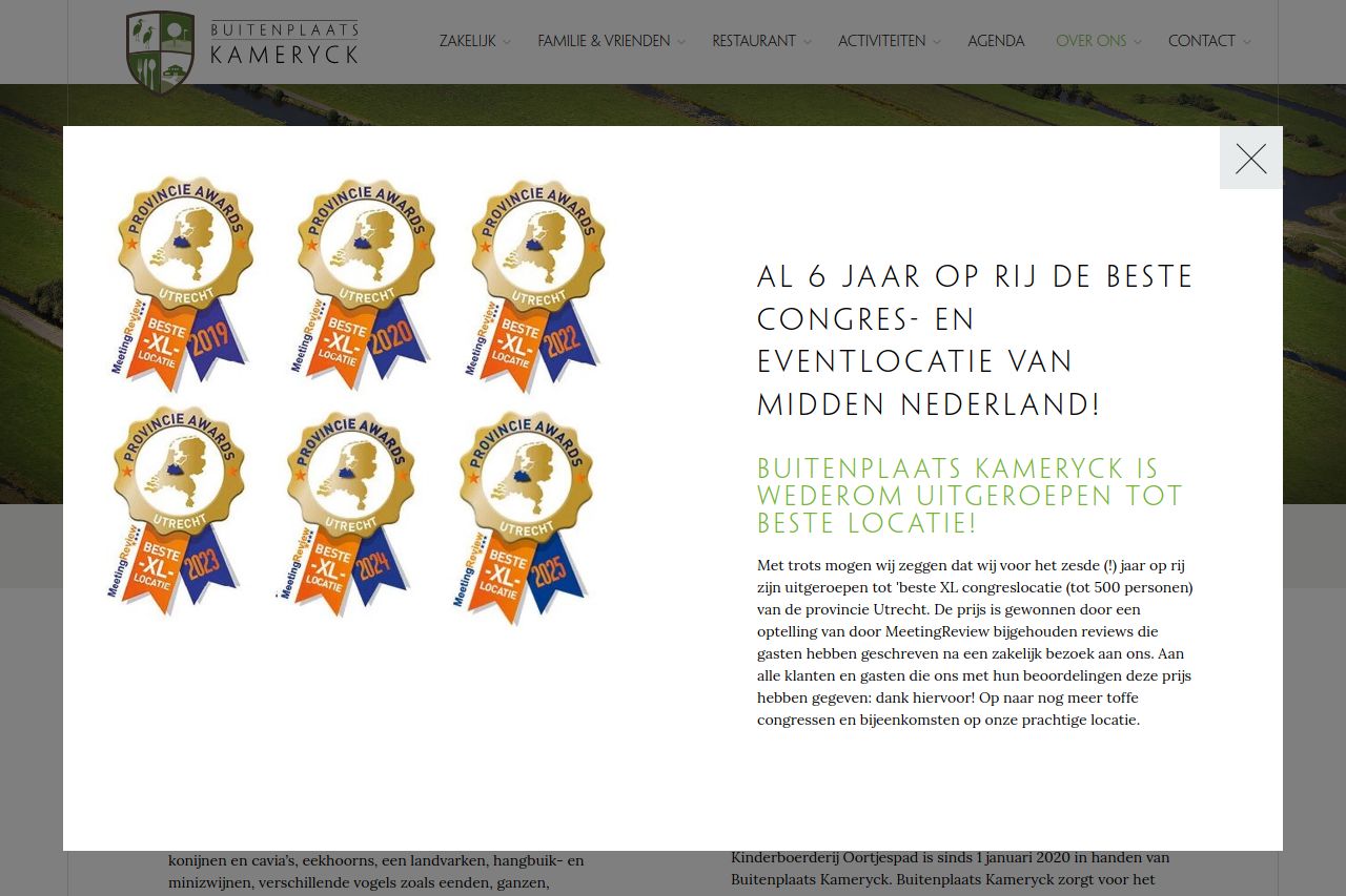
The landing page stands out with a clear display of awards and recognitions, which effectively communicates credibility. However, the text block accompanying the awards is too lengthy and lacks breaks, making it tedious to read. The color scheme is decent, ensuring the primary text stands out, but the overall layout feels cluttered due to the overlapping text and image elements. This negatively impacts user experience. Call to action elements are missing, leaving the reader unsure about the next steps after viewing the awards. Consistent use of fonts and colors aligns with brand identity, yet there's a lack of hierarchy in text presentation, causing significant readability issues.
- Simplify the text next to the awards to be more concise and engaging.
- Introduce clear call-to-action buttons, guiding users on the next steps.
- Improve design layout by reducing clutter and enhancing text hierarchy.