azena.life
Landing Page Analysis
Welcome to Azena Health & Longevity, where you are our primary care. Serving Gainesville and North Central Florida with personalized health and wellness.
Summary:
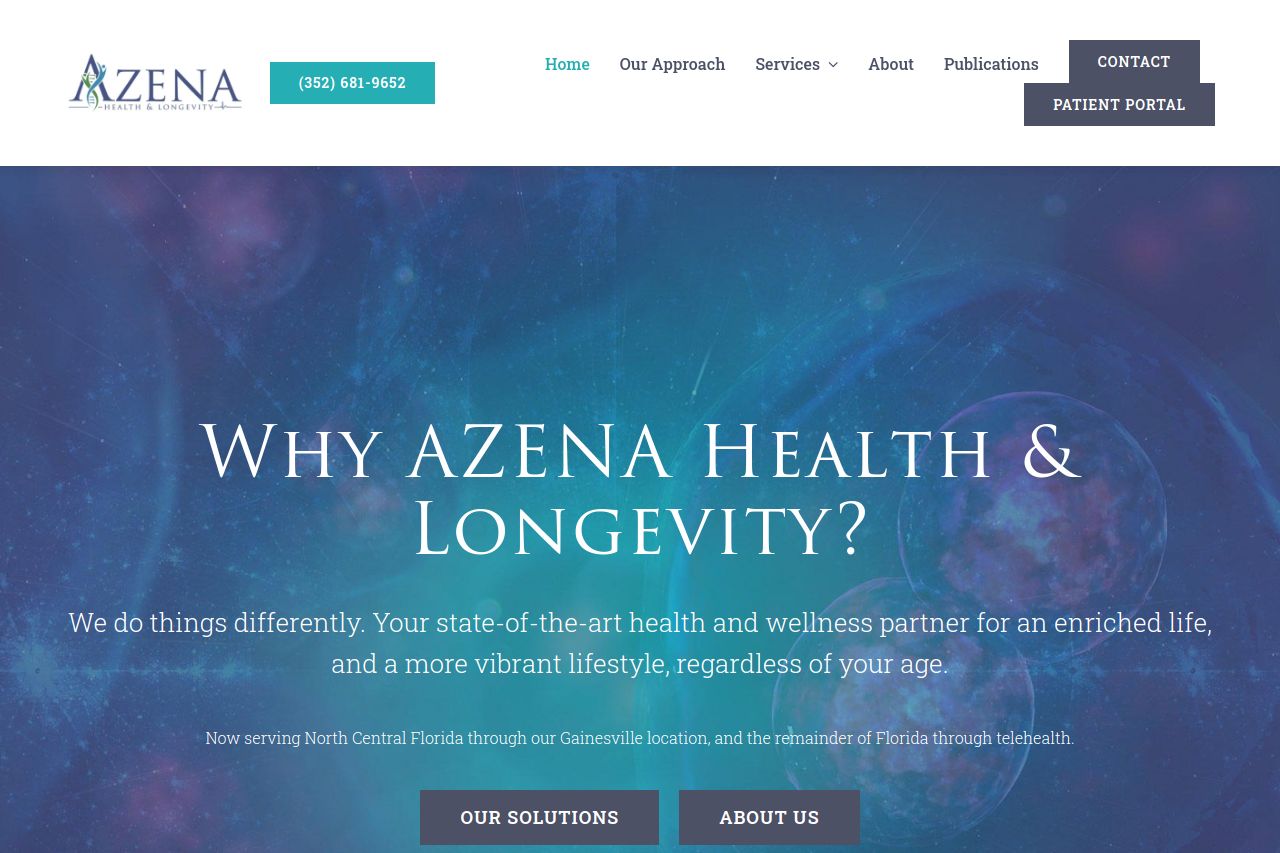
The landing page for AZENA Health & Longevity attempts to convey a sense of personalized and comprehensive health services. There is a consistent use of branding elements and a clear attempt to communicate a unique approach to wellness. However, the messaging tends to be quite generic and lacks specificity. It uses grandiose statements like "Your state-of-the-art health and wellness partner," which sounds promising but doesn't deliver a clear value proposition. The use of bold, expansive text in the hero and subsequent sections does grab attention, but the lack of contrasting colors makes some text blend into the background, reducing visual impact.
Typography generally remains consistent, yet some headings can become hard to distinguish because of over-styling - like thin and serif fonts, which aren't the easiest to read. The site's structure does a reasonable job of segmenting different healthcare offerings, but it lacks an interactive or engaging functionality that might guide the user towards taking action.
While the credibility is reinforced with professional-looking images and a logical layout, it misses stronger social proof elements like testimonials or client success stories that would build trust more effectively. CTAs are a mix in visibility, with some blending too much into the background due to lack of contrast or emphasis. Social media icons and contact information are somewhat subdued, making the platform more static than interactive. Overall, the page carries a professional layout but doesn't fully engage or direct potential clients through a decisive user journey.
- Enhance the contrast of text over background images for better readability.
- Incorporate more engaging social proof like testimonials or client stories.
- Simplify the messaging to make it more specific and less generic.
- Optimize CTA buttons to stand out more and guide user action effectively.