reg4u.nl
Landing Page Analysis
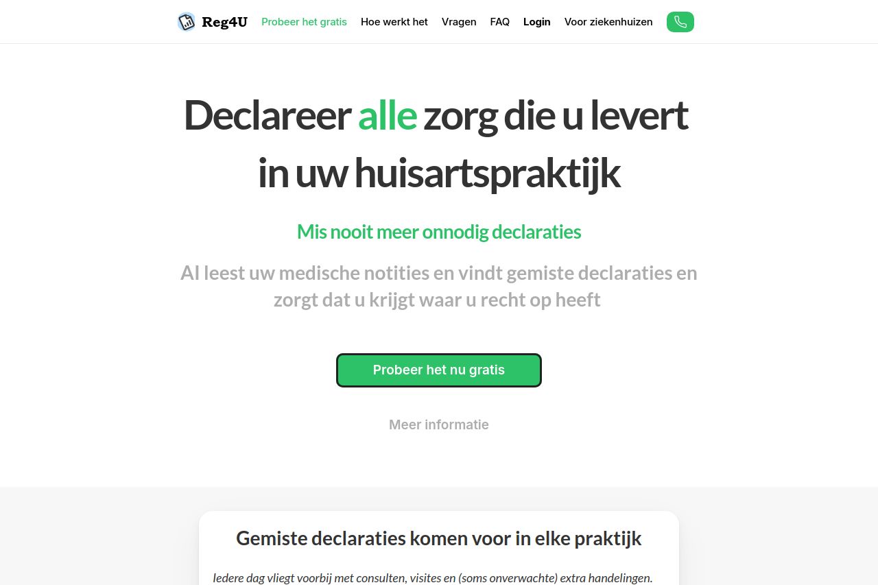
Laat geen geld liggen: krijg de inkomsten waar u recht op heeft
Summary:
This landing page does some things well, like attempting to set a clear value proposition for its audience and using direct language in its calls to action. However, several areas need improvement.
The design choices are somewhat effective in terms of simplicity, but they lack visual appeal and consistency. Font sizes and weights aren’t well utilized to establish a clear visual hierarchy. Colors are used wisely to denote CTAs, but there’s not enough emphasis on creating a more compelling and memorable engagement through visuals.
The structure is lacking due to sections being disjointed. While explanations are provided for different components, navigation through the headings isn’t intuitive. The actionability remains mixed; the CTAs do stand out but can benefit from improved placements and relevance. The use of urgency or scarcity is absent, which could help drive conversions. Credibility could be better achieved through more social proof elements, such as client logos or testimonials.
- Improve the visual hierarchy with varied font sizes and weights.
- Add more social proof like testimonials or client logos.
- Enhance the CTA placement to follow each informative section.