nickhrm.de
Landing Page Analysis
Astro description
53
Share on:
Summary:
50
Messaging
70
Readability
60
Structure
50
Actionability
50
Design
20
Credibility
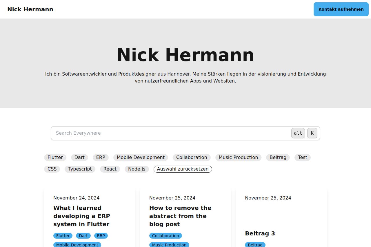
The landing page is straightforward with a clean design, but it doesn't do much to grab attention or stand out. The value proposition and what the site offers aren't immediately clear, and the content feels scattered without a strong unifying theme or focus. The typography is readable, but there's little visual hierarchy, making it hard to distinguish between different types of information. The "Kontakt aufnehmen" button is prominent, but the rest of the CTAs blend too much into the content. There's an apparent lack of social proof or elements that build trust. Overall, it's a decent attempt, but it needs more thought into clarity and engagement.
Main Recommendations:
- Clarify the site's main purpose or value proposition prominently near the top.
- Improve the visual hierarchy by using font size and color to differentiate sections.
- Incorporate social proof like reviews or testimonials to build credibility.