carrd.co
Landing Page Analysis
Ivy English Courses
Summary:
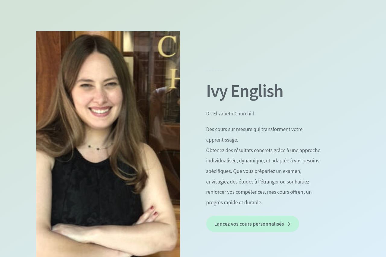
The landing page does a decent job of visually portraying a personal, friendly image with the photo of the instructor, which adds a touch of warmth. However, the color palette, while calm, lacks contrast and risks making the text hard to read. The messaging is overly generic, with phrases like "une approche individualisée" that could apply to any service provider. The call-to-action buttons are clear in placement but lack the urgency or compelling language that might drive immediate action from visitors. Despite some good testimonials, there's room to reinforce credibility with more concrete evidence or recognizable badges. Consistency is maintained across sections, which is a plus, but overall, the page could benefit from a more engaging, dynamic design to truly stand out.
- Enhance contrast between text and background for better readability.
- Improve the messaging with more specific benefits and outcomes.
- Add more social proof elements like recognizable logos or trust badges.